Bringing Consistency to Complex Systems
bp
bp is a global energy company operating large-scale systems across fleet management and operational risk environments.
Context
Scanning the Landscape
I worked with bp across three separate contracts, supporting different teams and products within a large, evolving digital ecosystem.
The work spanned fleet management tools, a central design system, and a risk management platform used in high-stakes operational environments.
Each area presented its own challenges, but a common theme ran throughout. Complex systems, fragmented experiences, and a growing need for consistency across products, teams, and regions.
The goal was to improve clarity, usability, and alignment. Not just within individual tools, but across the wider platform and design system.
Process
Joining the Dots
I started with a fleet management platform, carrying out a full heuristic review to identify usability issues, inconsistencies, and gaps in the experience.
Working closely with the product team, I translated wireframes into refined UI, improving structure, hierarchy, and interaction patterns. At the same time, I supported the evolution of a shared design system, helping bridge gaps while it continued to mature.
This meant creating interim components, defining patterns for forms and error states, and establishing templates to bring consistency to spacing, layout, and component relationships.
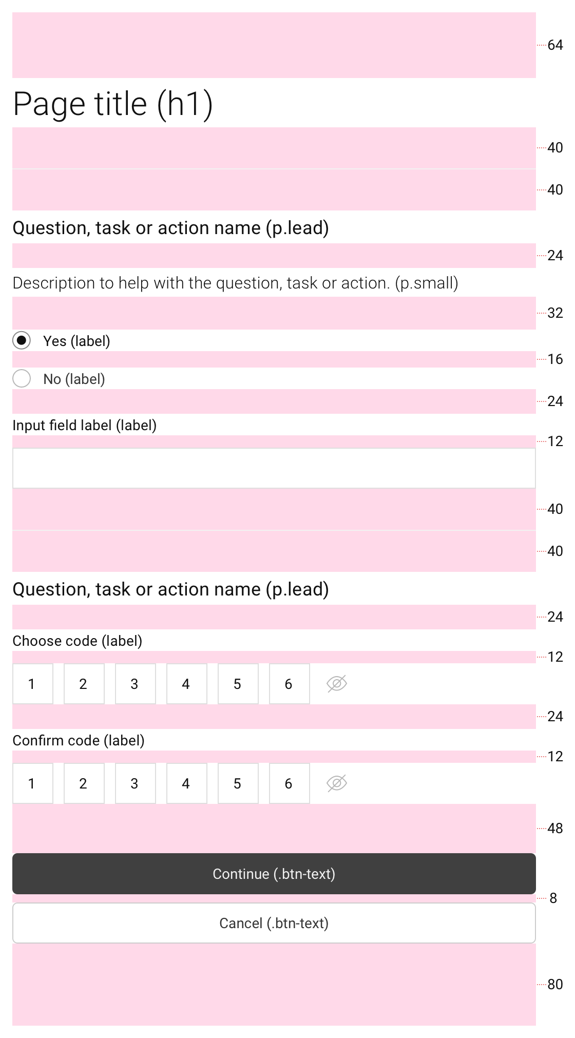
Vertical rhythm spacing example
[SMALL]
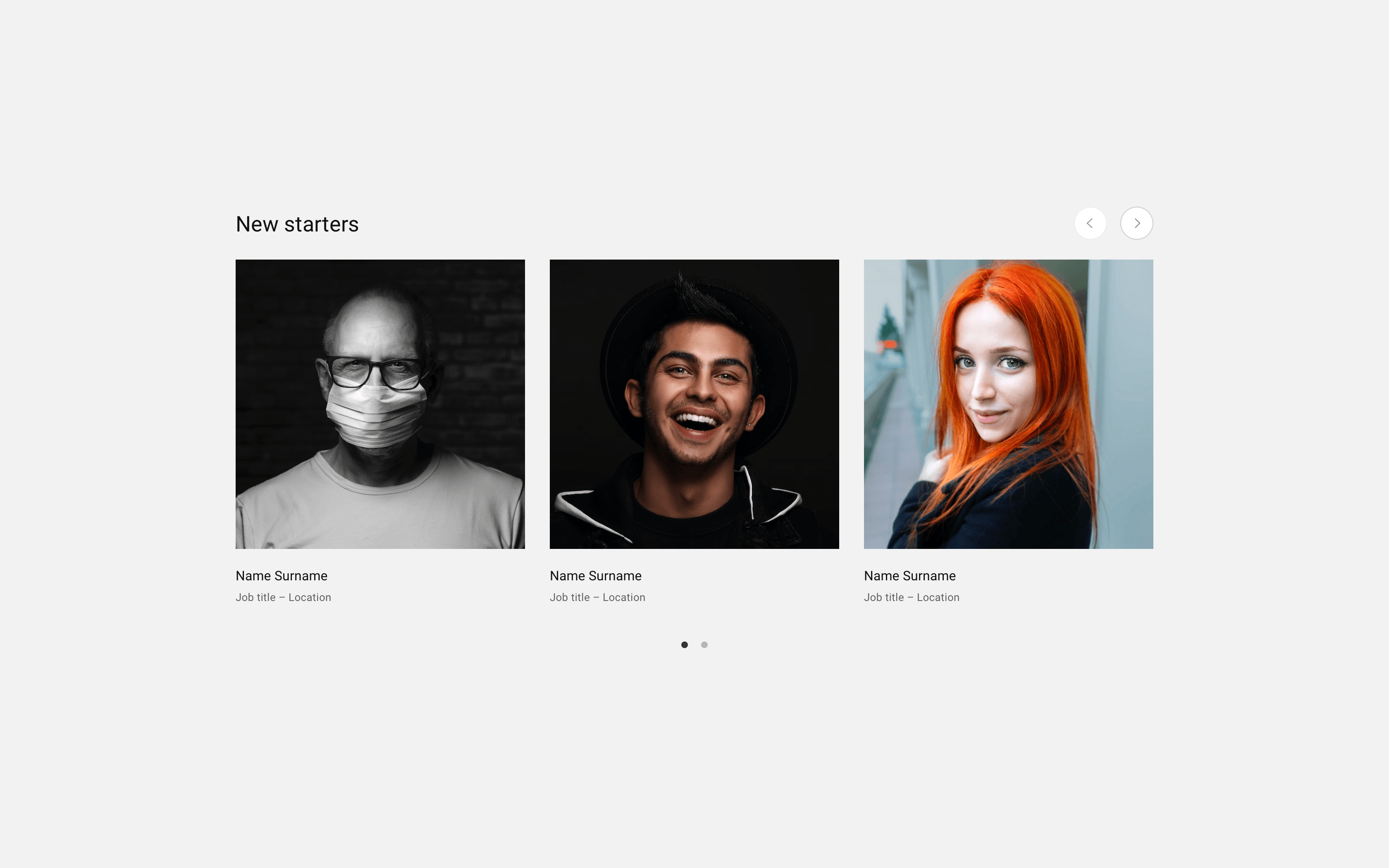
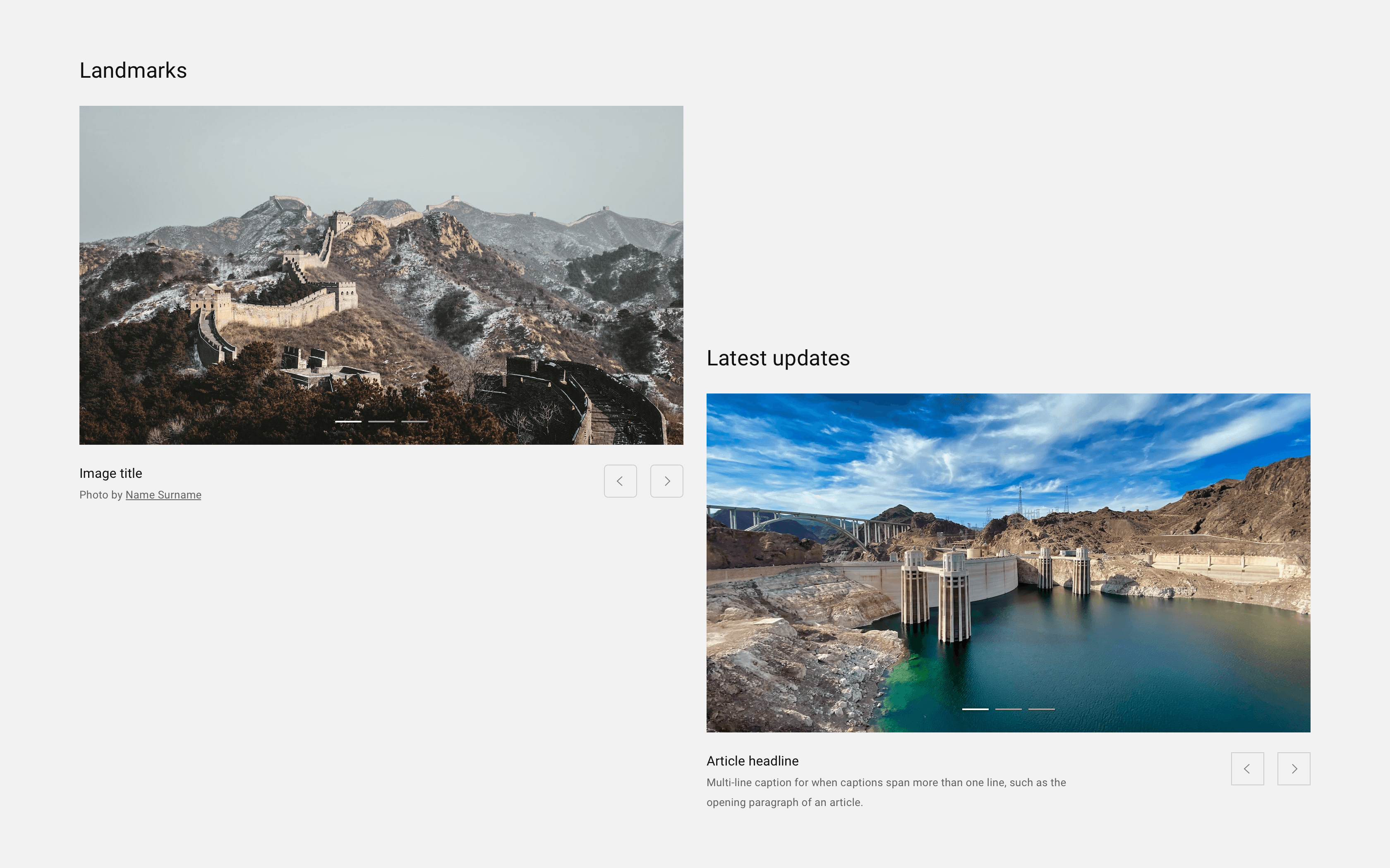
Following this work, I contributed more directly to the design system. The focus shifted to building scalable components at an atomic level, including carousels and data visualisation elements for both light and dark modes. I created variants, tested usage, and documented components to support wider adoption across teams.
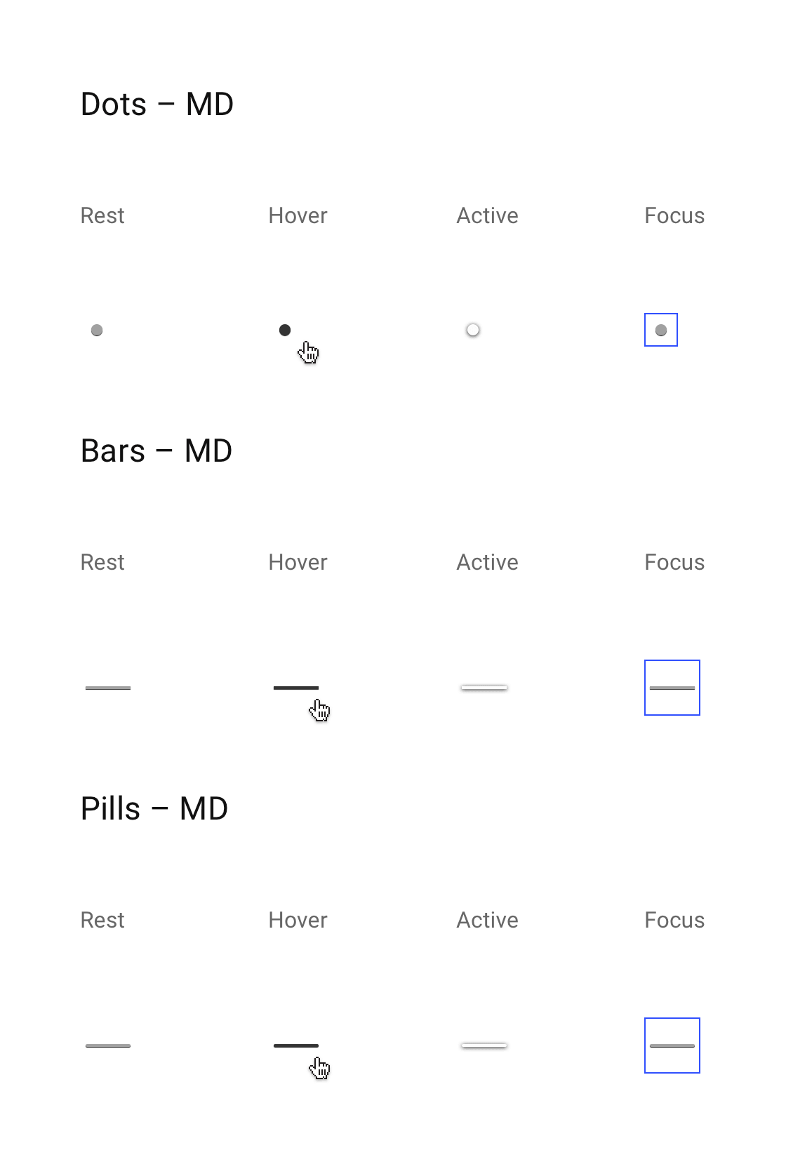
Pagination atoms example
[SMALL]
In a later phase, I worked on a risk management platform supporting operational safety workflows based on bowtie analysis models. The focus here was on improving complex user journeys, simplifying data capture, and making relationships between systems easier to understand.
Throughout all three phases, the approach remained consistent. Understand the problem deeply, simplify where possible, and create systems that others can build on.
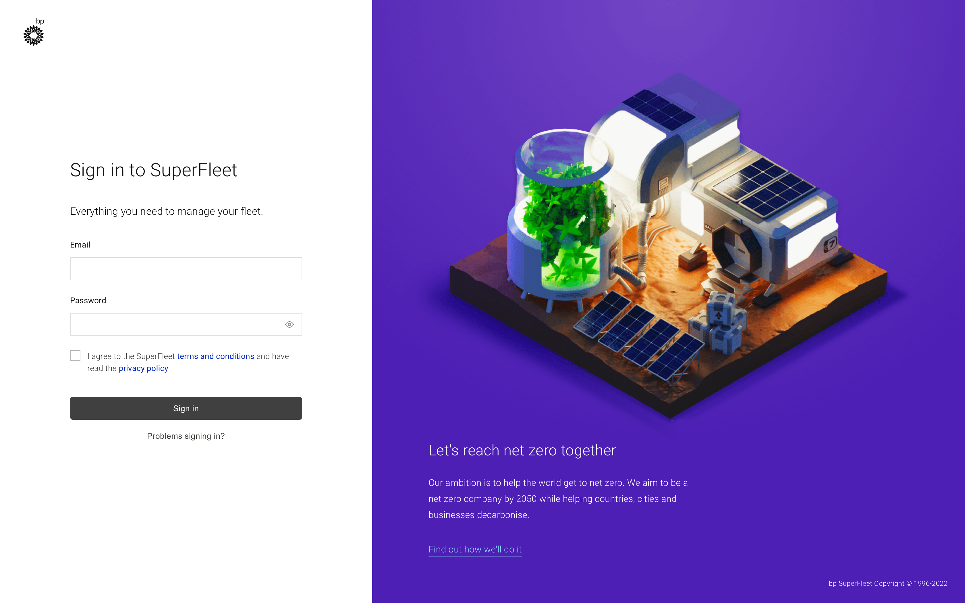
- Sign-in screen with dedicated marketing area
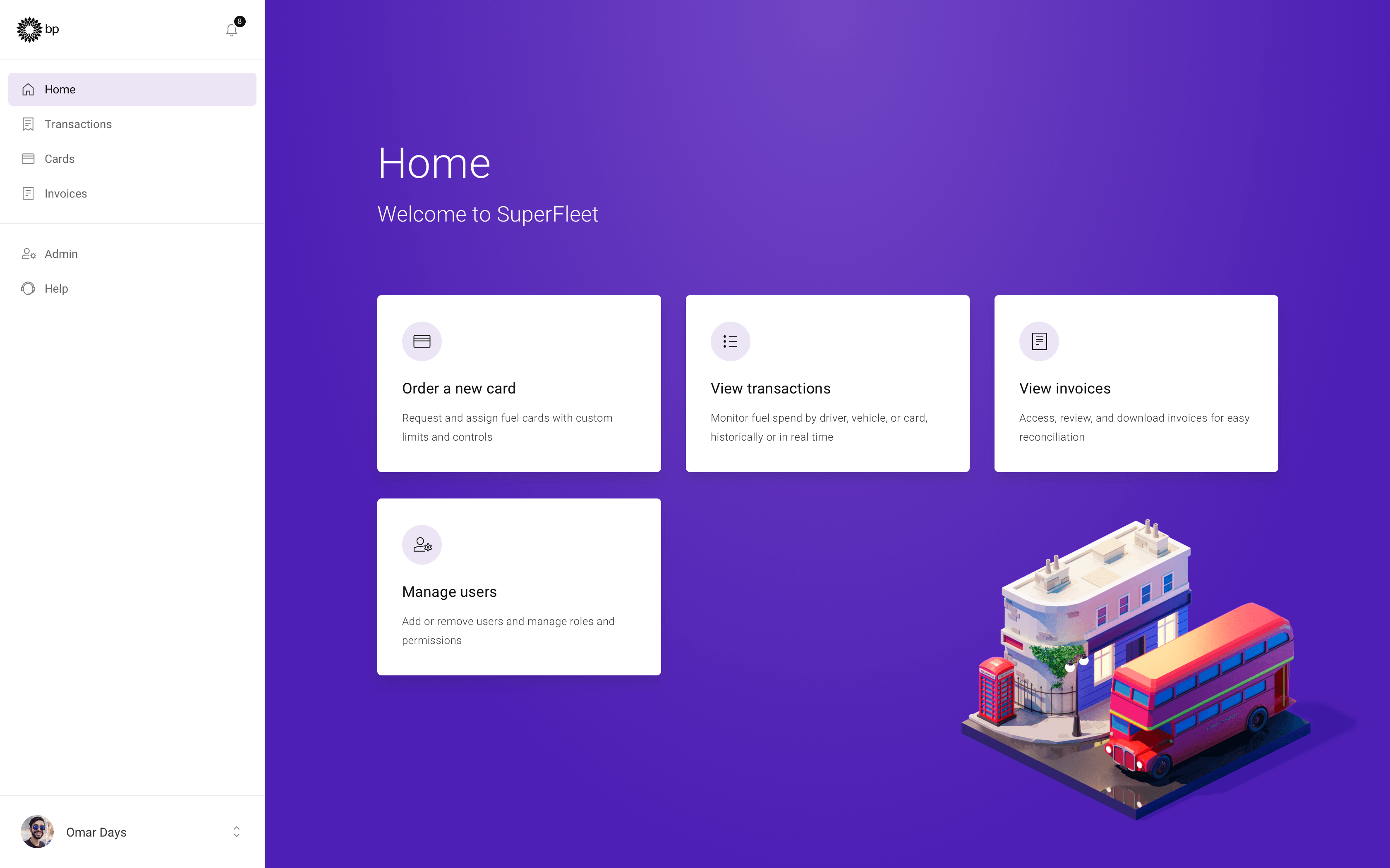
Image by Roman Klčo - Home screen dashboard with quick actions and navigation
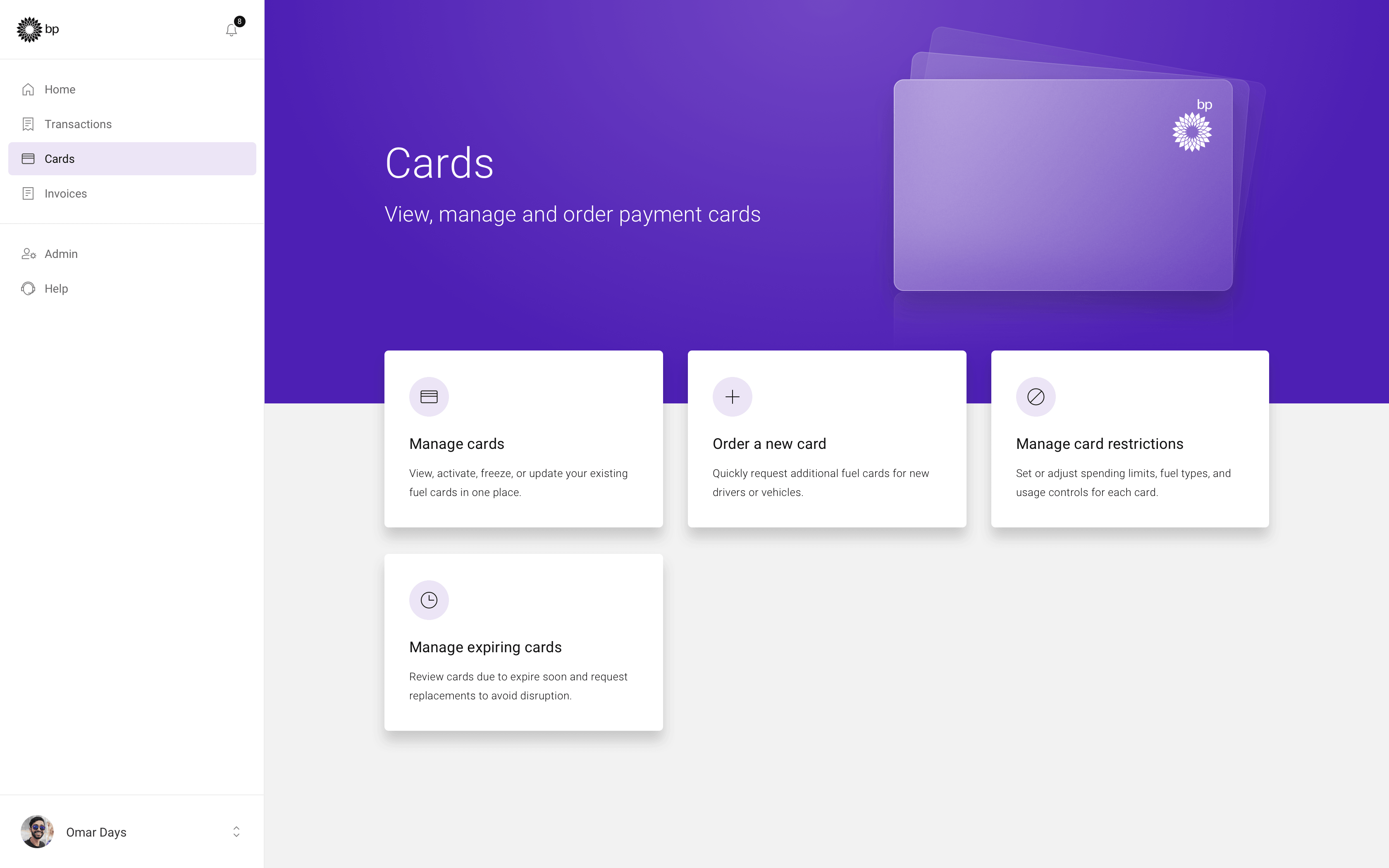
Image by Roman Klčo - Cards landing screen with quick actions
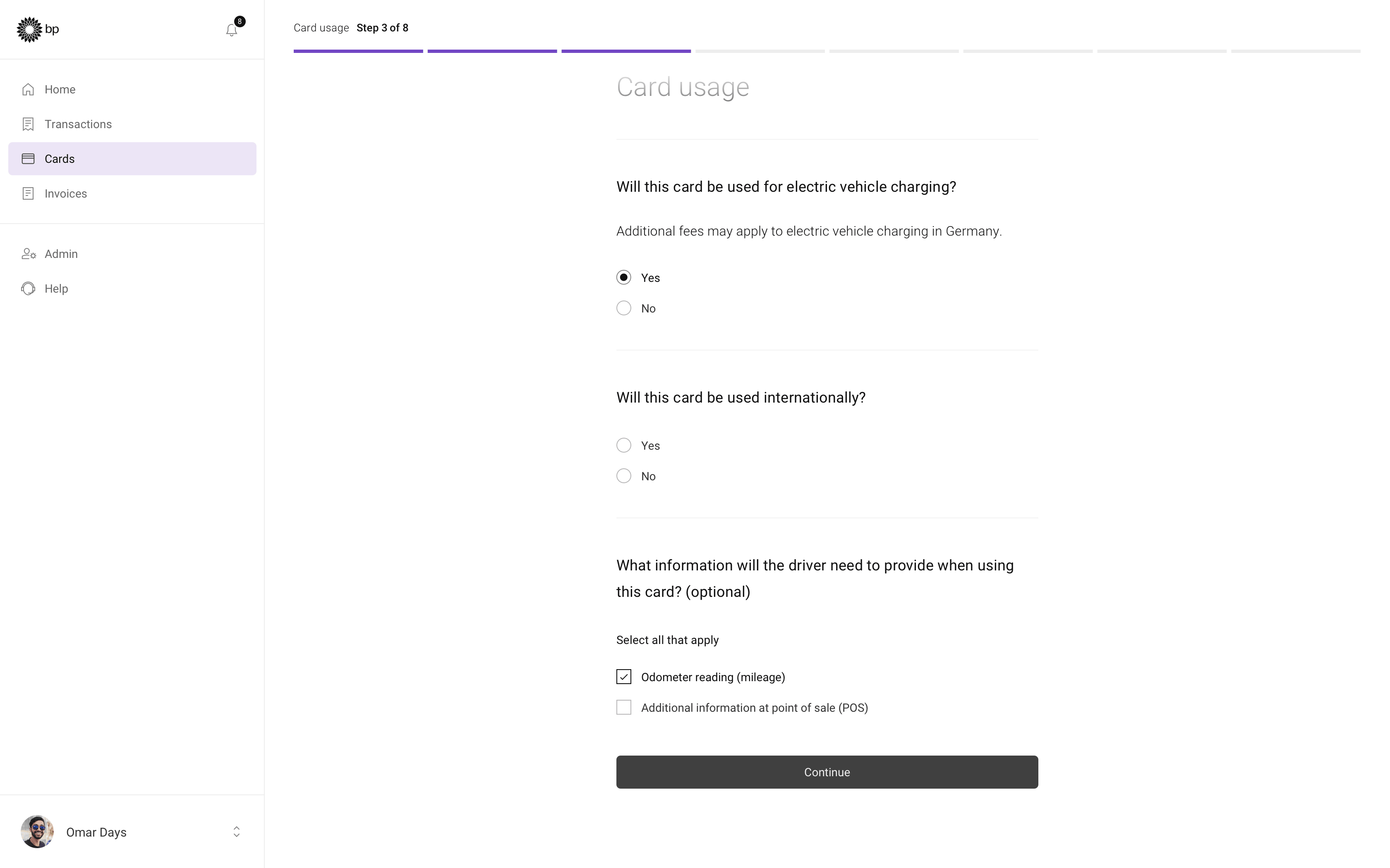
- Card ordering flow: Card usage
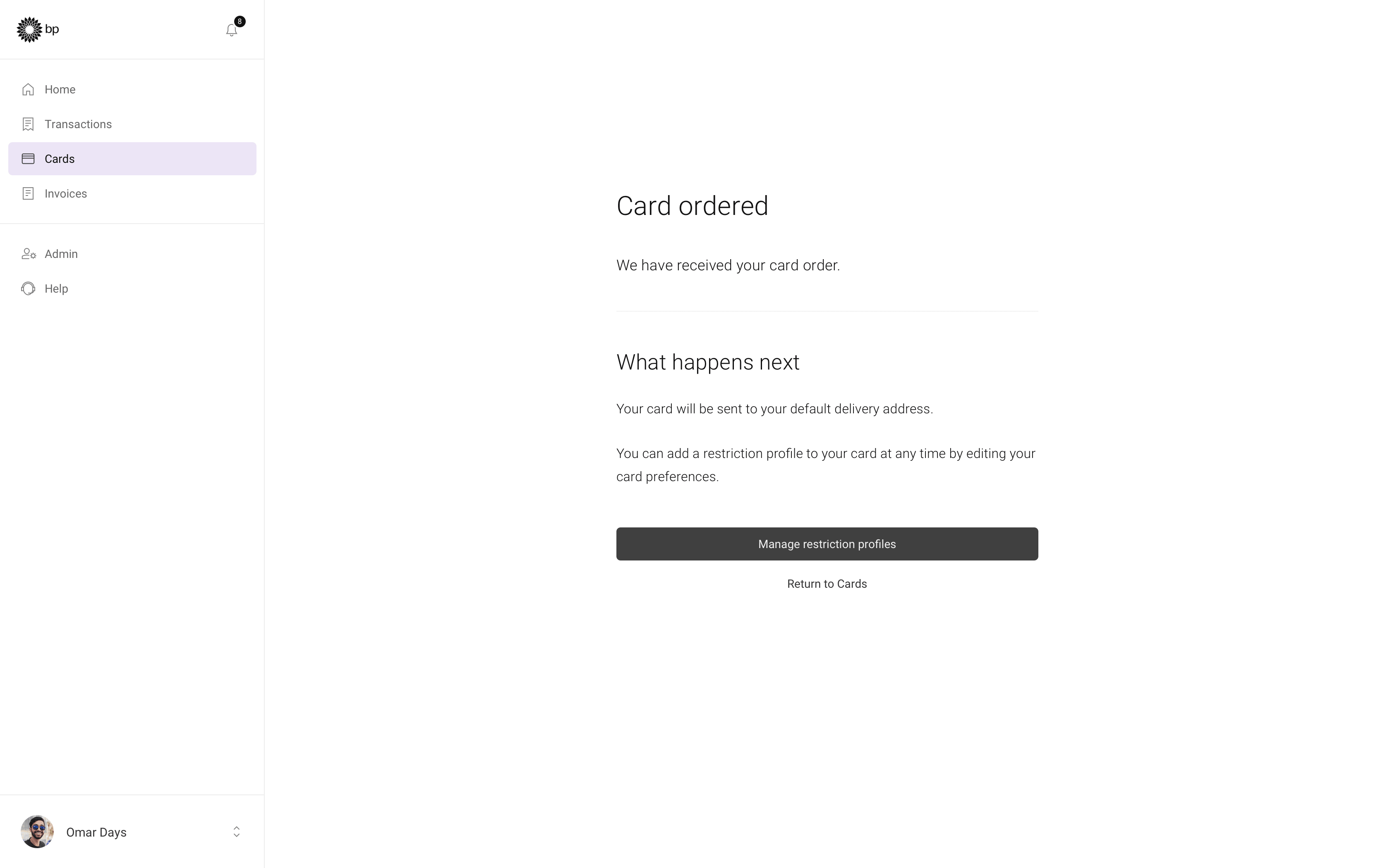
- Card order confirmation screen
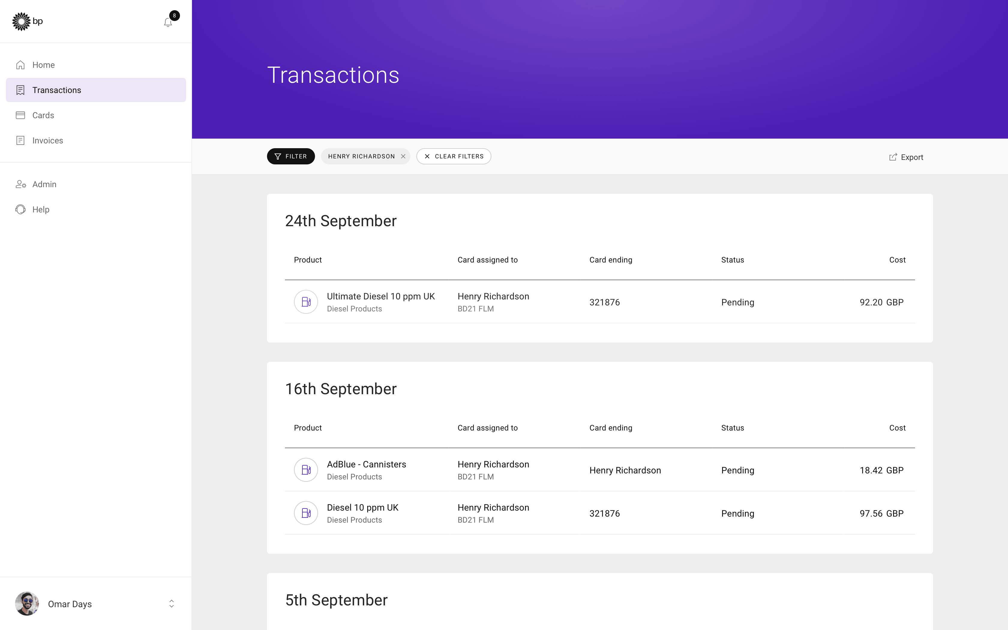
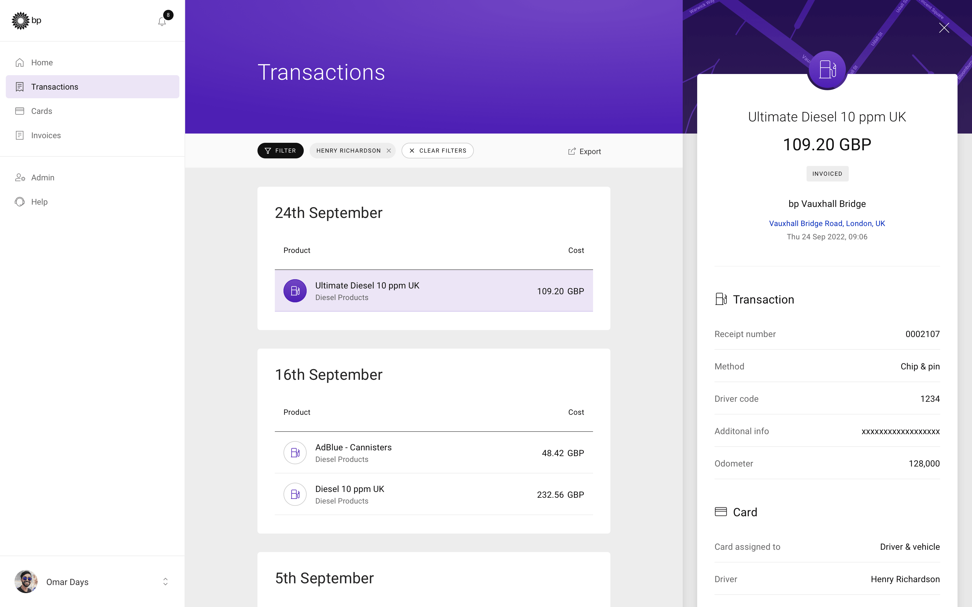
- Itemised transactions list view
- Transaction details drawer
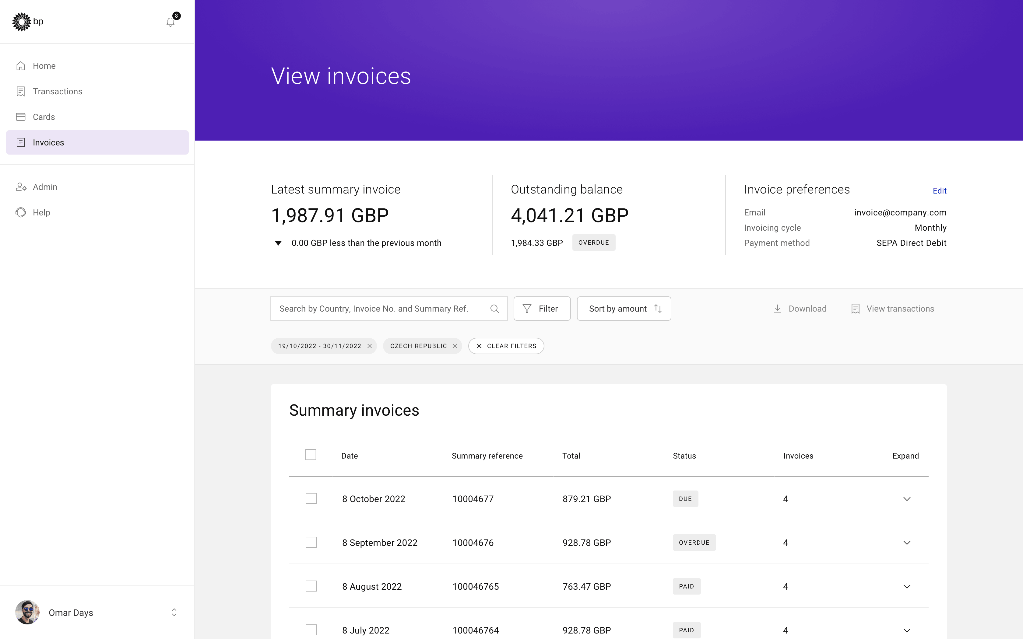
- Invoices screen with filters applied
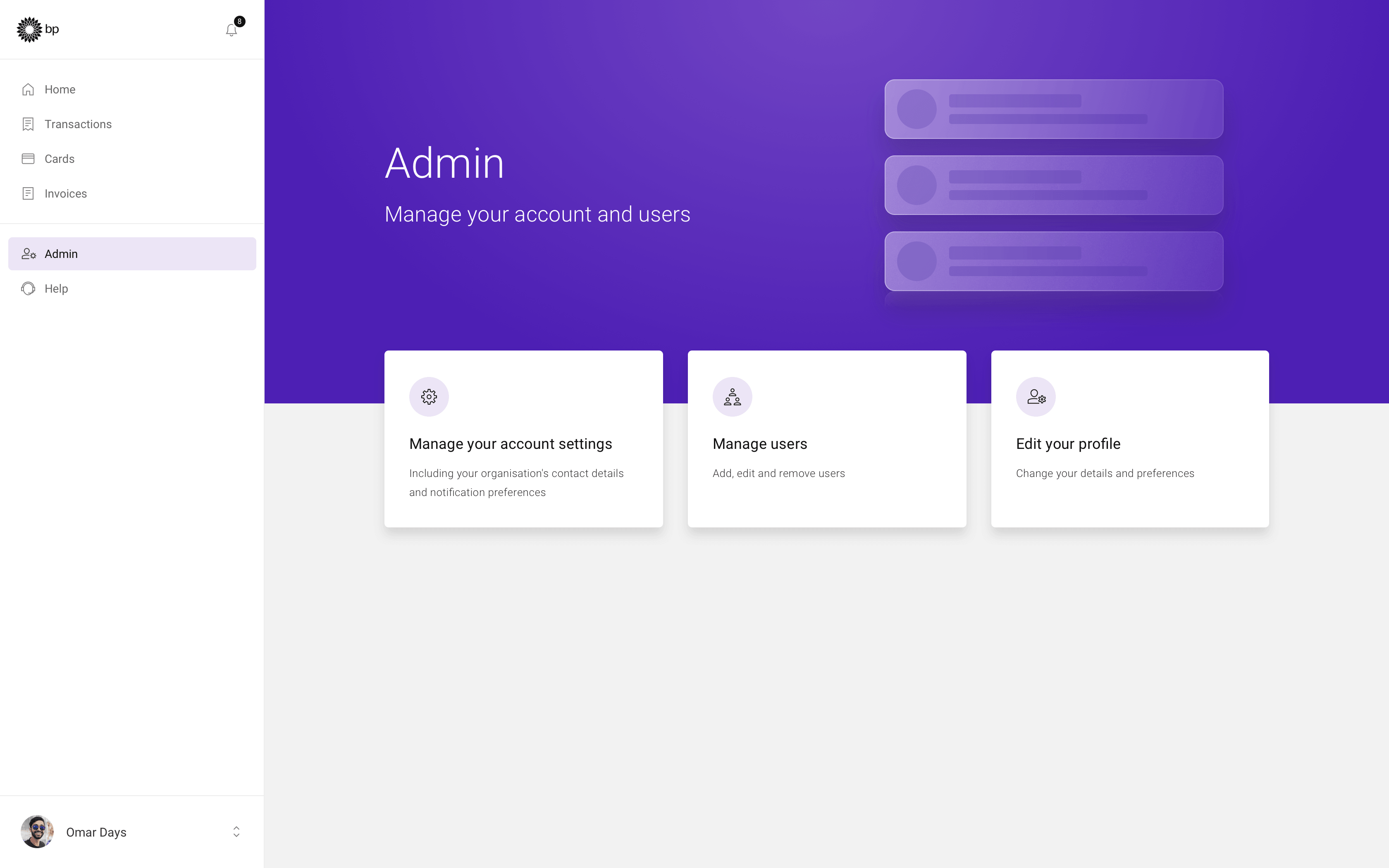
- Admin dashboard with quick actions
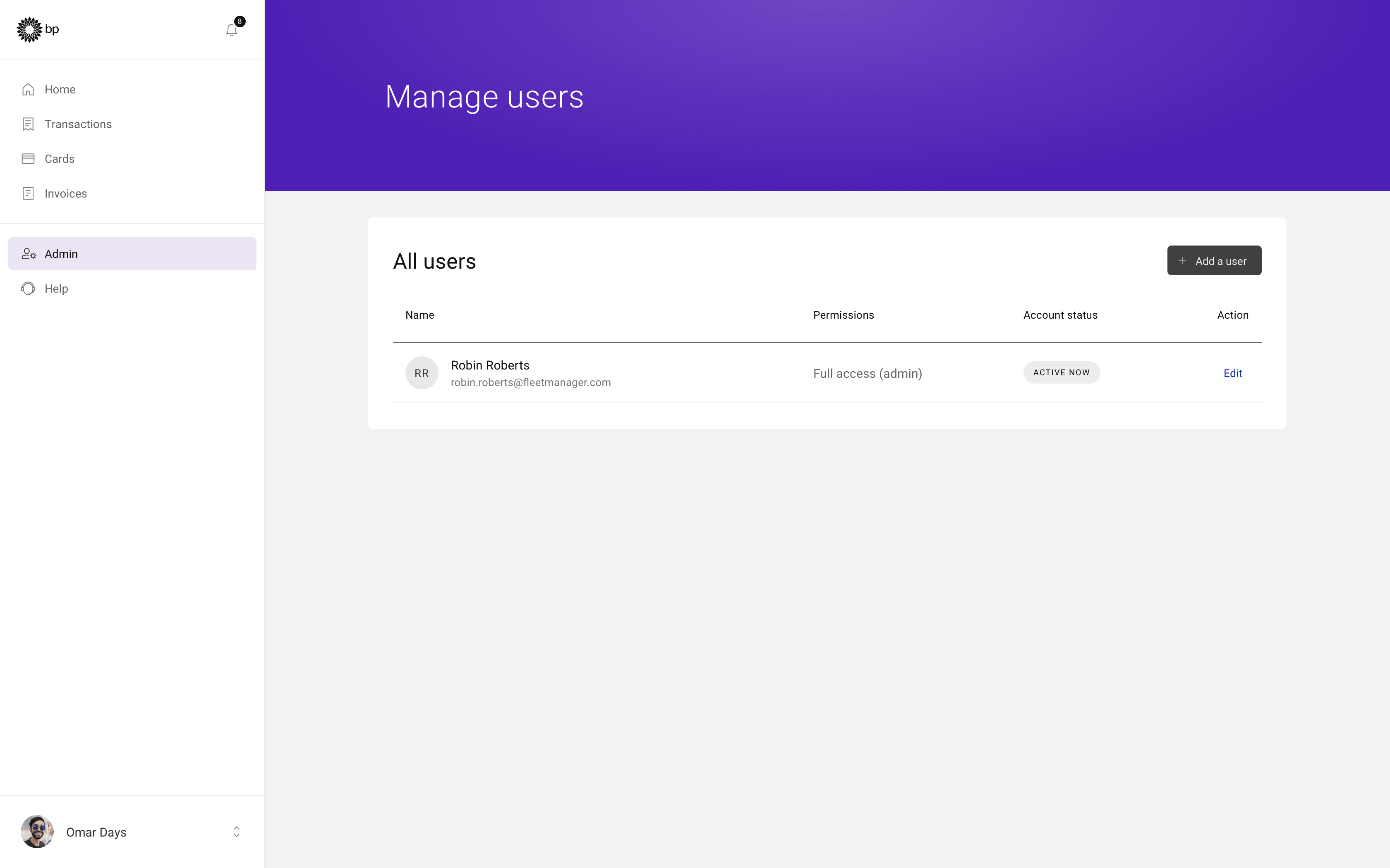
- Admin user list view
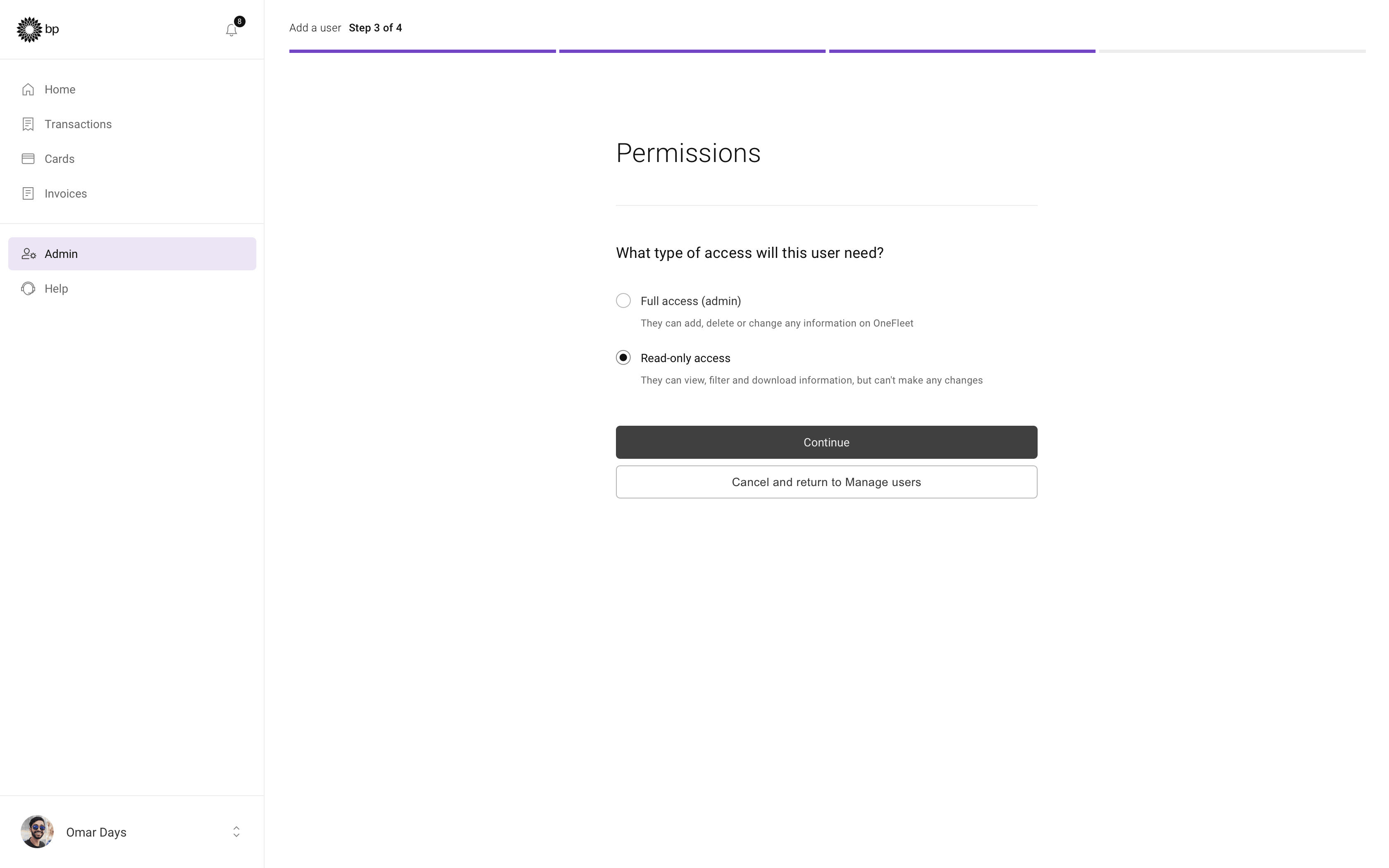
- Add user flow: Permissions
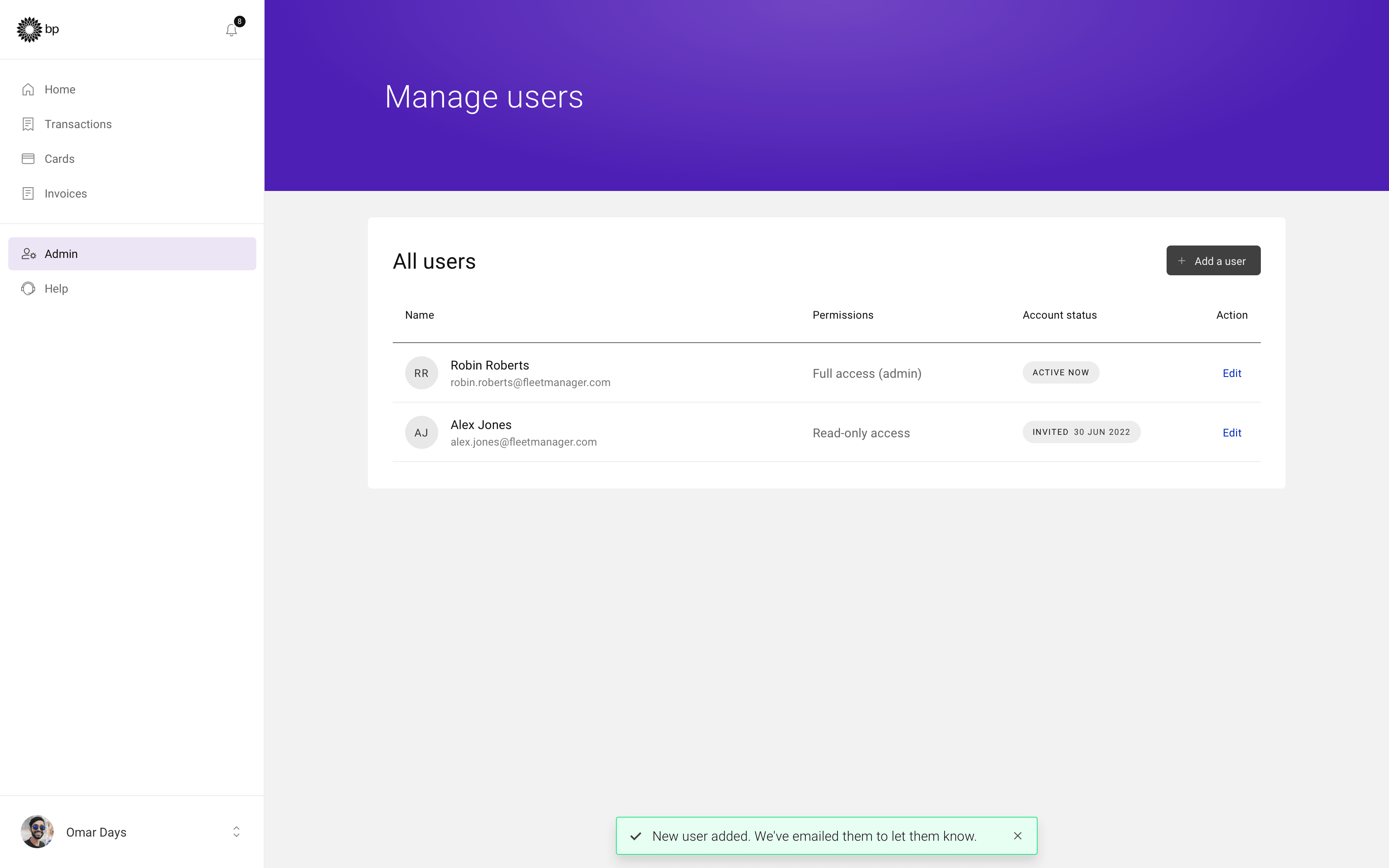
- Admin user list with new user added
- Sign-in screen with dedicated marketing area
Image by Roman Klčo - Home screen dashboard with quick actions and navigation
Image by Roman Klčo - Cards landing screen with quick actions
- Card ordering flow: Card usage
- Card order confirmation screen
- Itemised transactions list view
- Transaction details drawer
- Invoices screen with filters applied
- Admin dashboard with quick actions
- Admin user list view
- Add user flow: Permissions
- Admin user list with new user added
Solution
Systems in Practice
The work delivered improvements across multiple products and teams, bringing greater clarity, consistency, and scalability.
Across fleet management tools:
- Conducted a full UX/UI audit to identify friction points and usability issues
- Designed and refined key screens from wireframes, improving structure and interaction
- Created interim design system components to bridge gaps
- Established templates for layout, spacing, forms, and error handling
- Introduced an isometric, polygon-based illustration style to improve clarity and brand perception, using people-free visuals to reduce bias
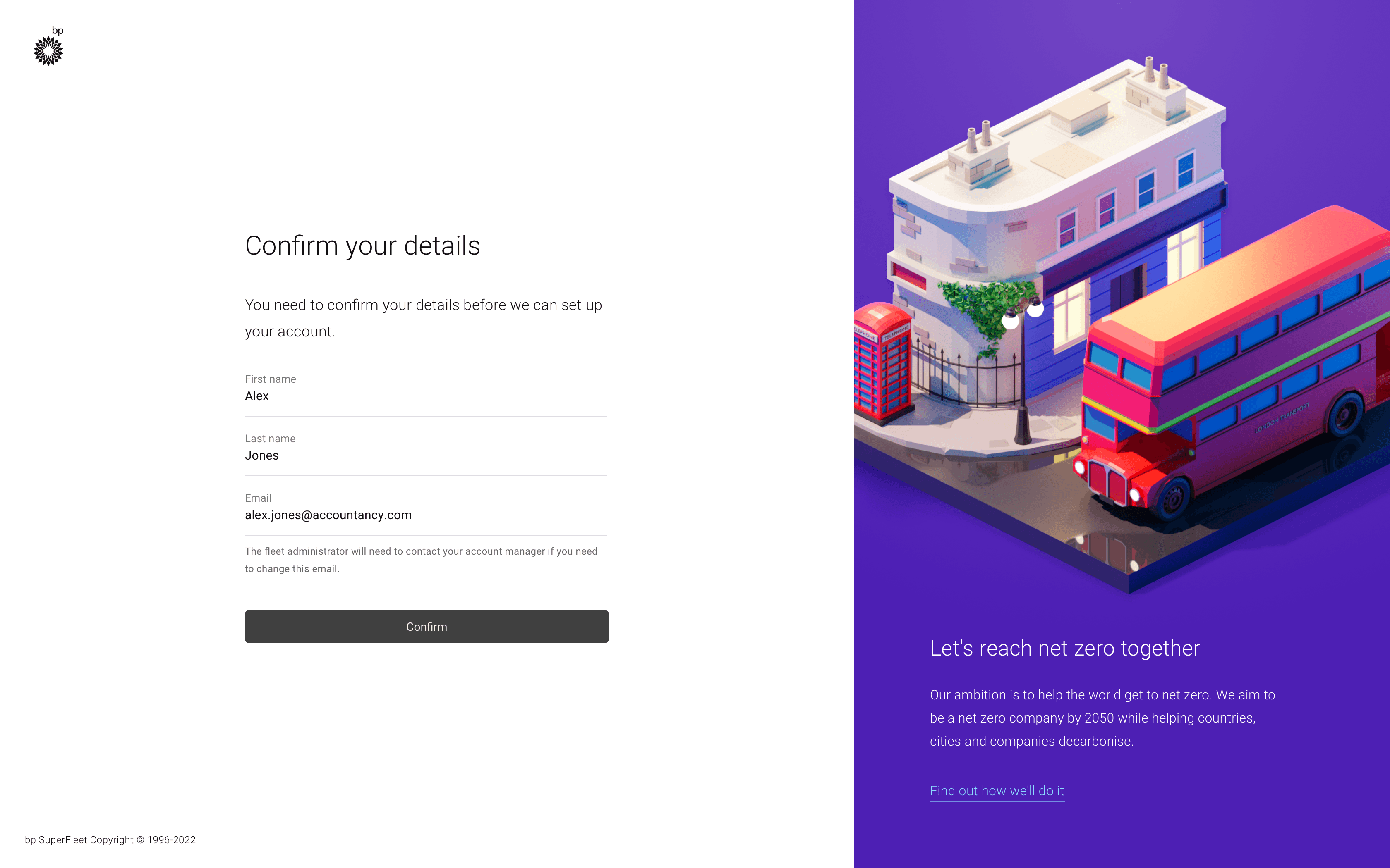
Account setup screen with proposed illustration style
Image by Roman Klčo, Polygon Runway
Within the design system:
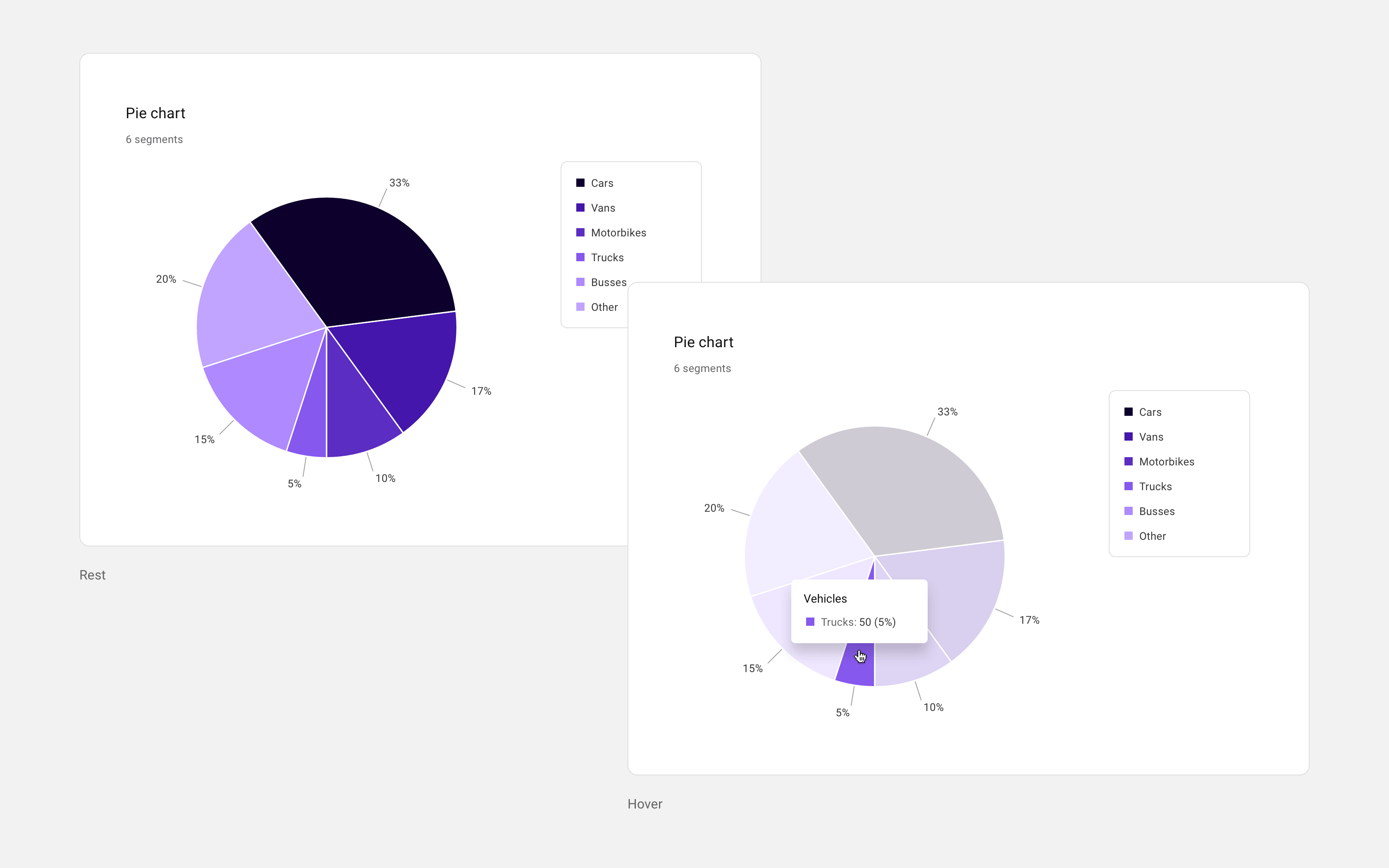
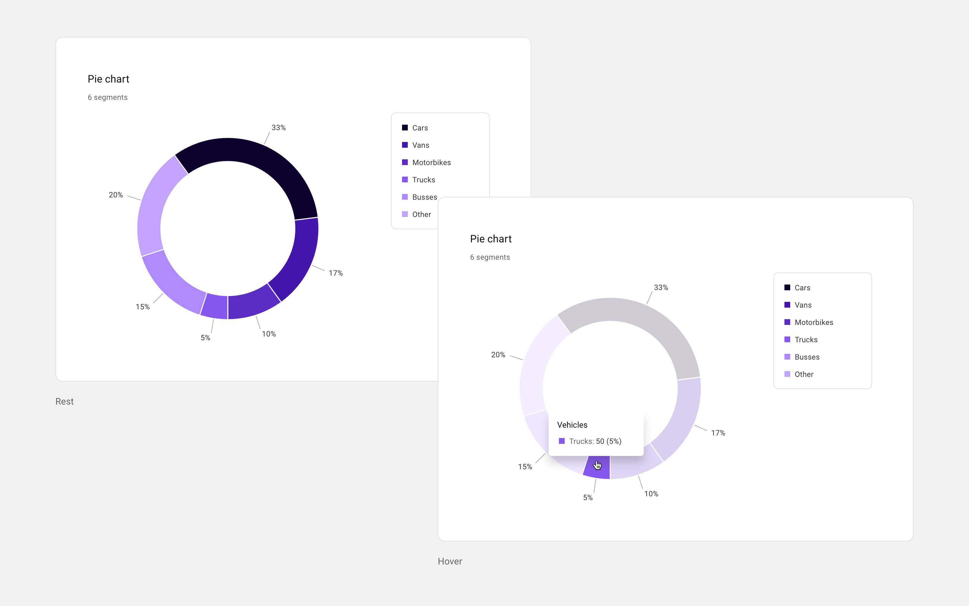
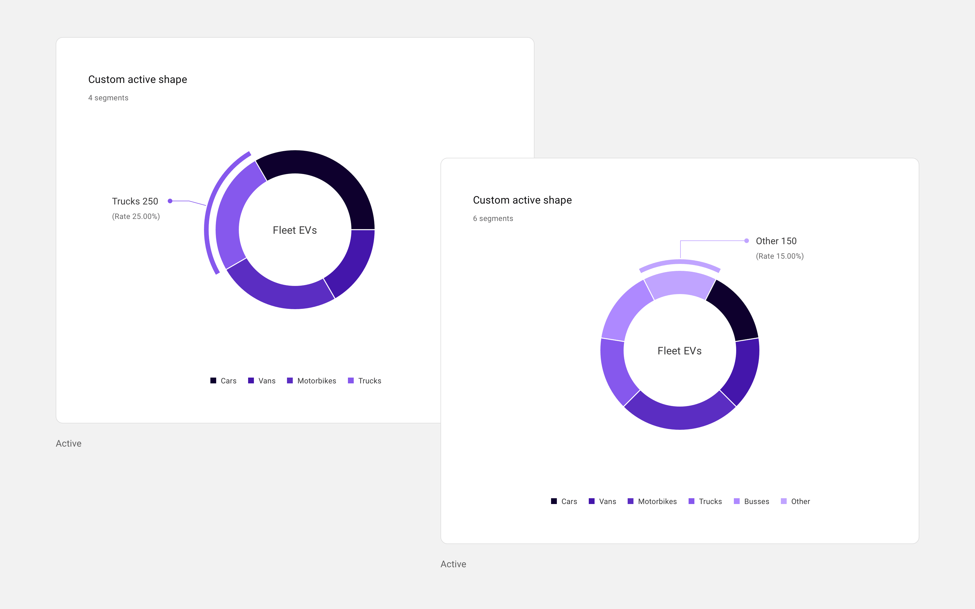
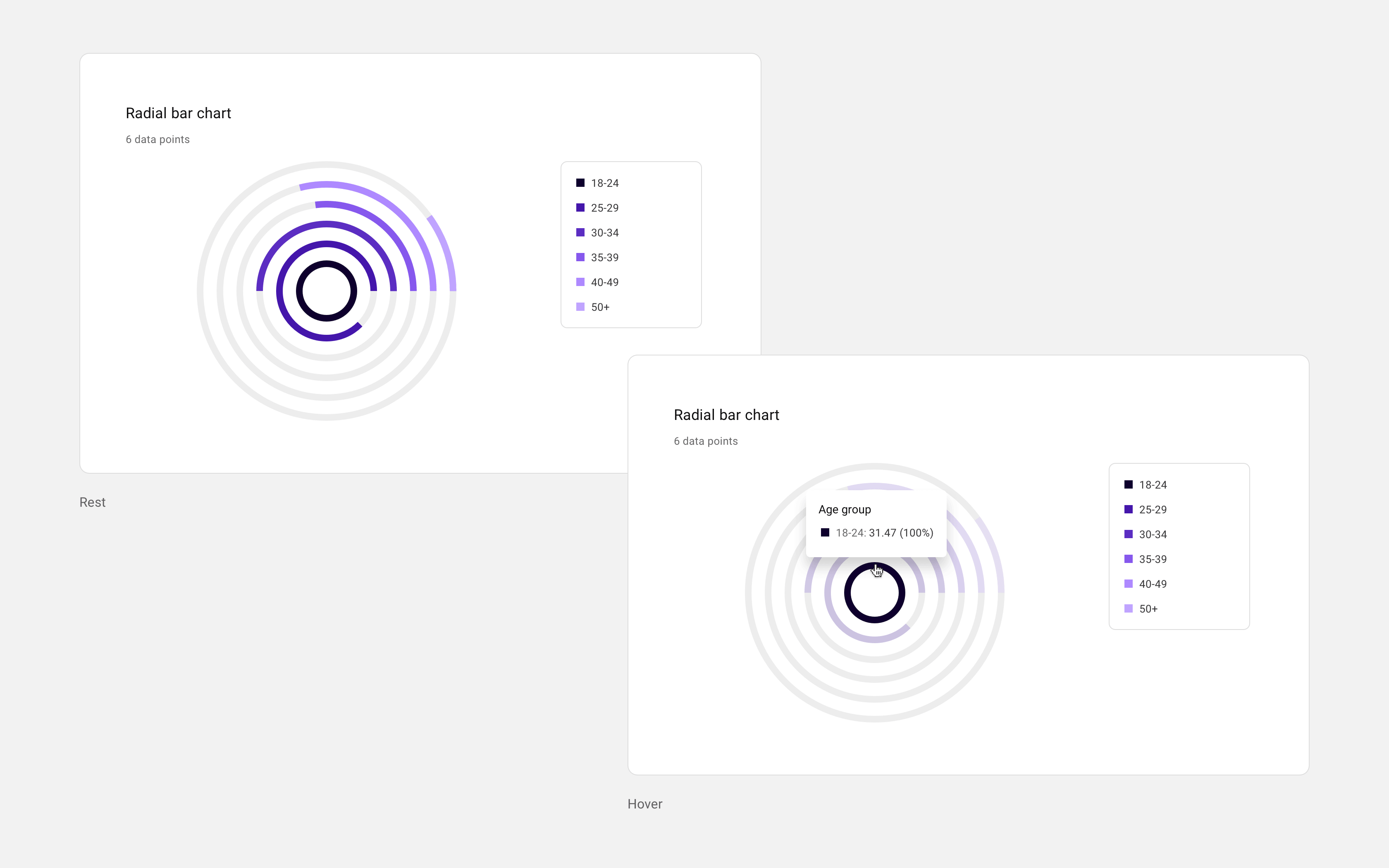
- Defined and delivered scalable components including carousels and data visualisation patterns
- Designed for both light and dark modes
- Created component variants and usage examples
- Documented components to support adoption across teams
- Worked at an atomic level to ensure consistency and scalability
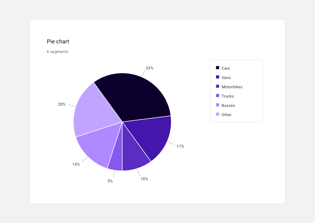
Pie chart organism example
[GROUP: Light + Dark]
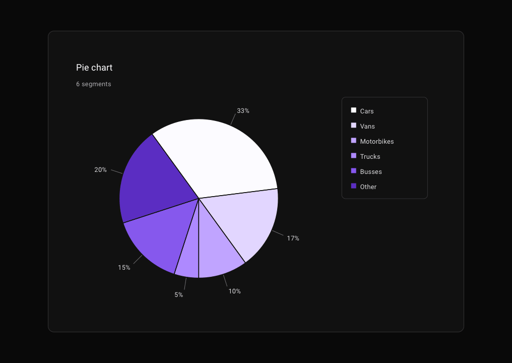
Pie chart organism example
[GROUP: Light + Dark]
Within the risk management platform:
- Improved the design system to align with evolving platform standards
- Simplified complex user journeys for creating and navigating operational workflows
- Redesigned the UI to better represent relationships between systems and processes
- Created detailed, high-fidelity prototypes to communicate interaction and behaviour
- Built reusable templates to support future design and prototyping work
- Supported internal tools to reduce friction in capturing and reporting issues
“Well done Jonathan for embedding user research and discovery as part of CI activity and gaining incredible insights into our users and their interaction behaviour”
— Nanda Balkissoon, Senior Project Manager
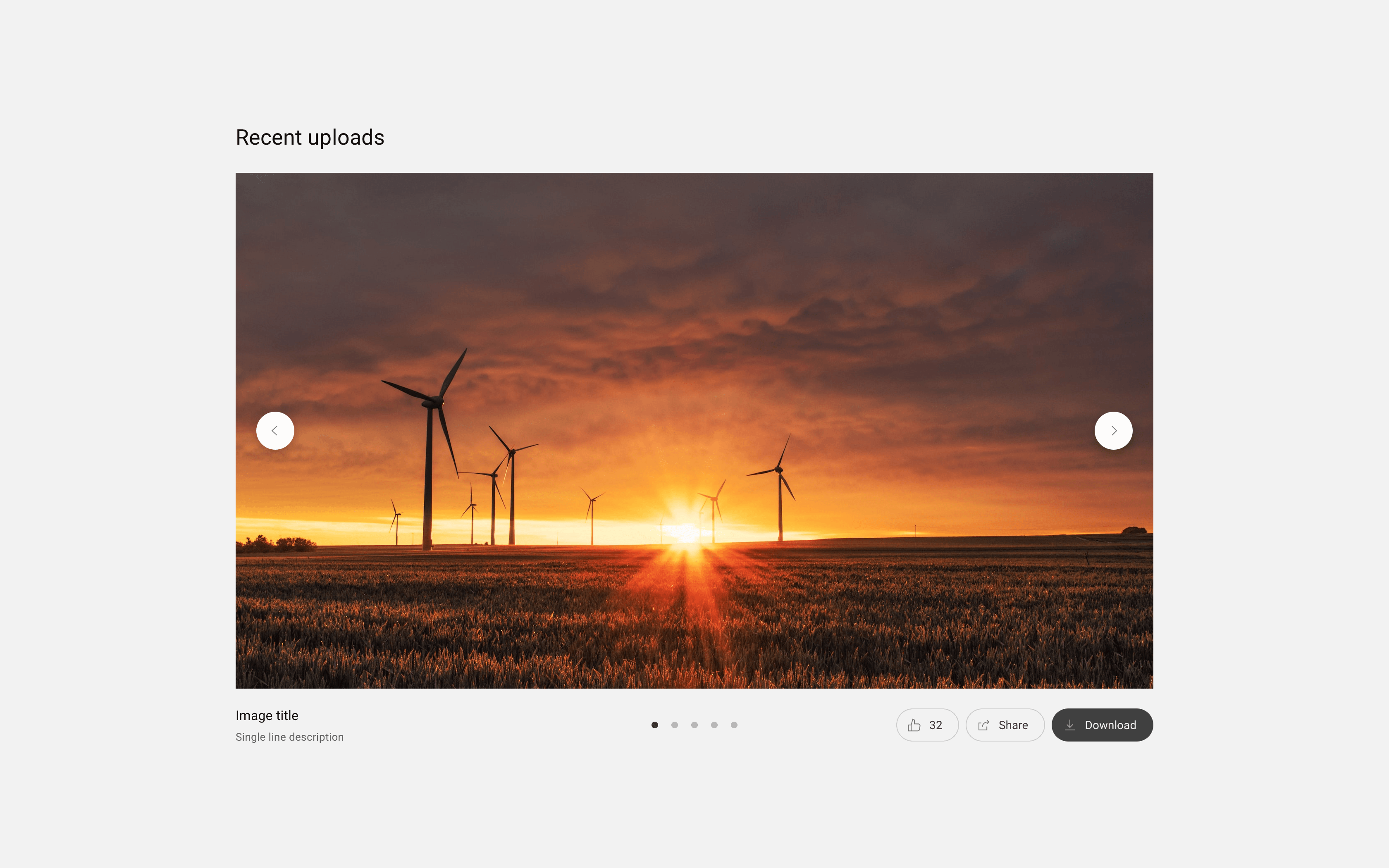
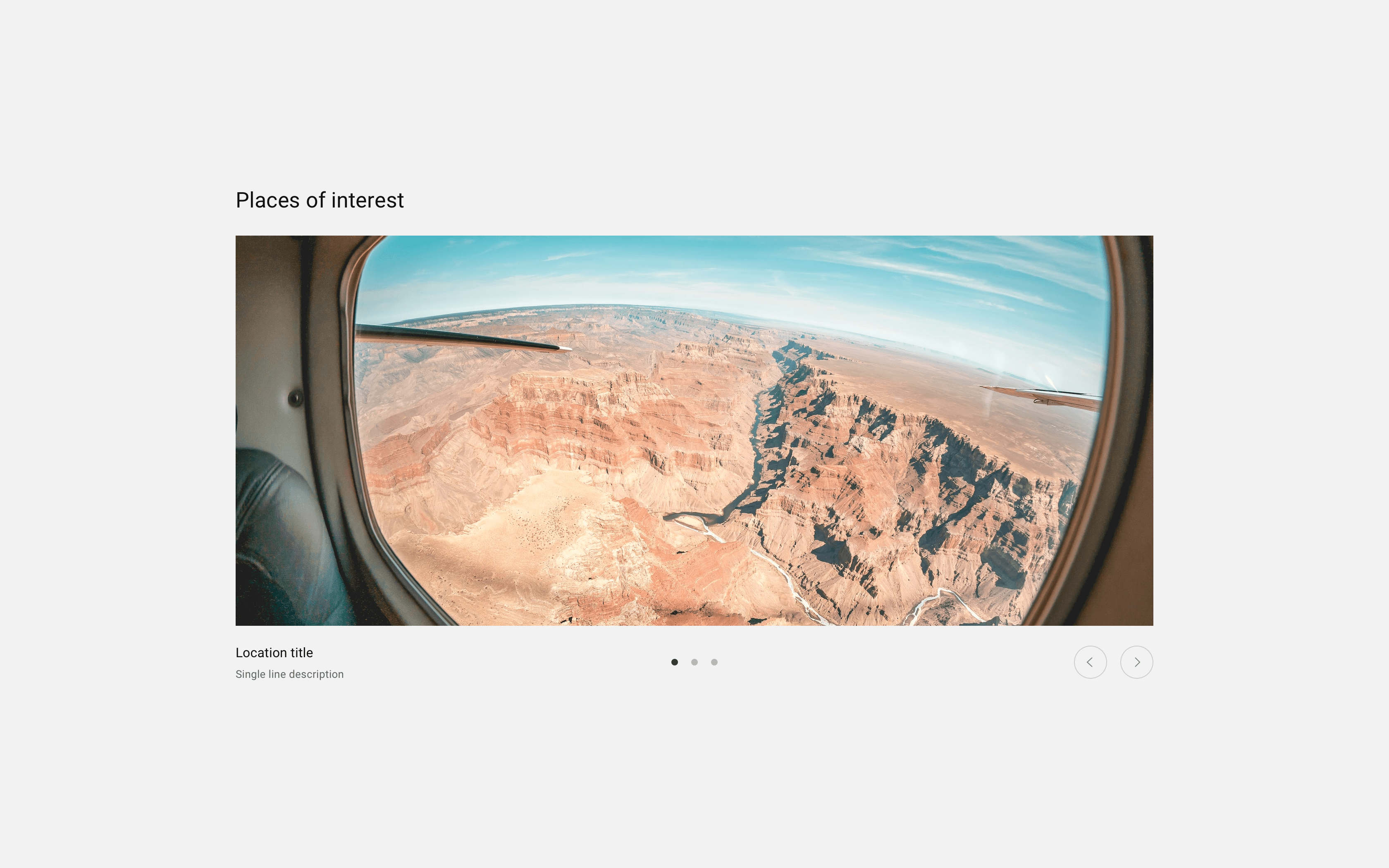
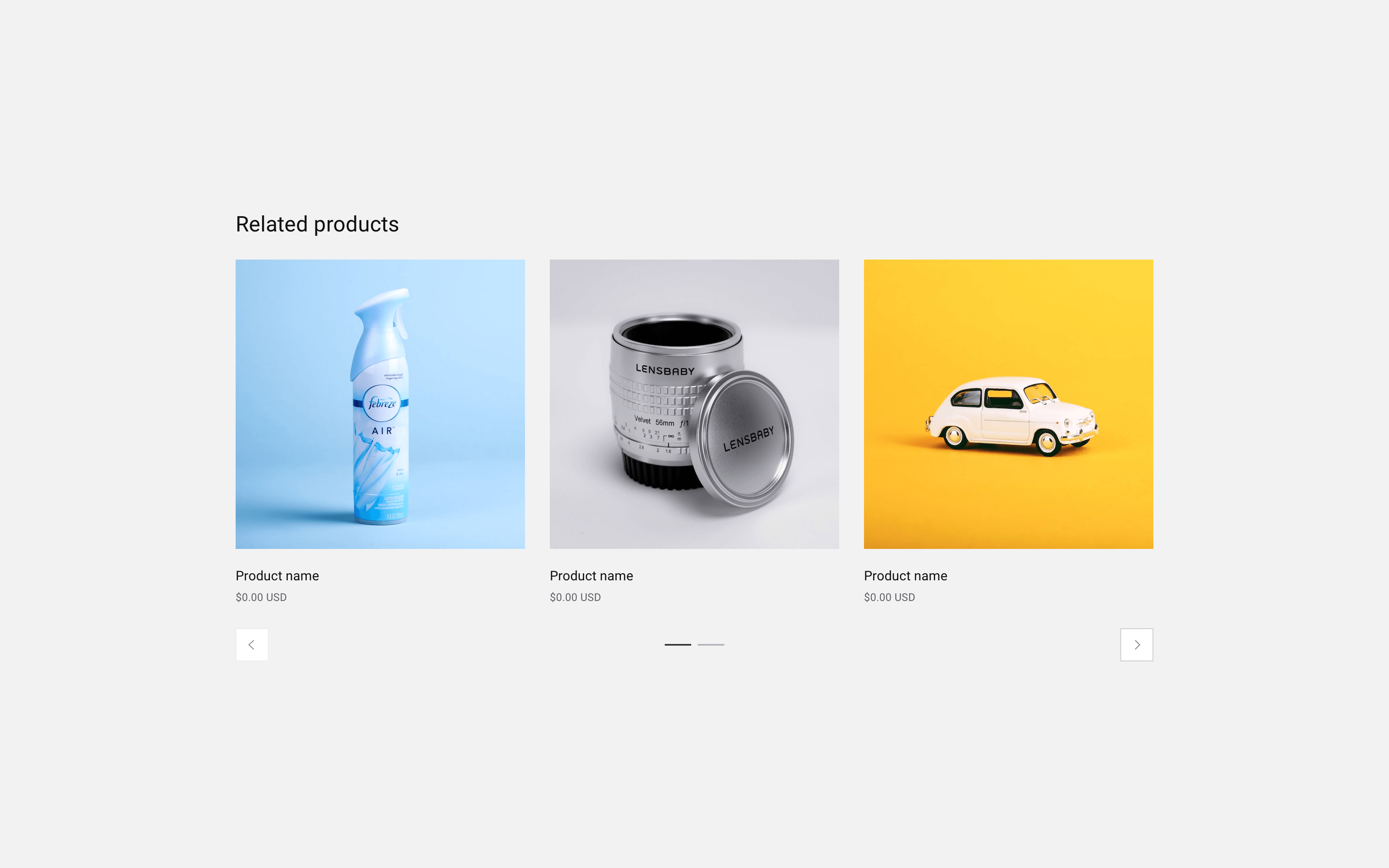
- Full-width carousel with overlaid controls and supporting actions
- Full-width carousel with captions and grouped tertiary controls
- Three-per-page carousel with split secondary square controls
- Three-per-page carousel with grouped secondary circular controls
- Single-focus carousels for images and articles with overlaid pagination
- Pie chart with rest and hover states
- Doughnut chart with rest and hover states
- Custom doughnut chart with active state label positioning
- Radial bar chart with rest and hover states
- Full-width carousel with overlaid controls and supporting actions
- Full-width carousel with captions and grouped tertiary controls
- Three-per-page carousel with split secondary square controls
- Three-per-page carousel with grouped secondary circular controls
- Single-focus carousels for images and articles with overlaid pagination
- Pie chart with rest and hover states
- Doughnut chart with rest and hover states
- Custom doughnut chart with active state label positioning
- Radial bar chart with rest and hover states
Impact
Power Delivered
The work improved usability, consistency, and collaboration across multiple teams and platforms.
- Clearer, more intuitive interfaces across operational tools
- Stronger alignment between product teams and the shared design system
- Scalable components and templates adopted across multiple projects
- Improved communication between design and engineering through detailed prototypes and documentation
- Simplified complex workflows, reducing friction and potential for user error
The success of the initial engagement led to continued collaboration across multiple contracts, reflecting the value of building strong relationships and delivering consistent results.
Reflection
In it for the Long Haul
This work reinforced the importance of designing beyond individual screens.
In complex organisations, the real impact comes from connecting systems, aligning teams, and creating foundations that scale. It is not just about solving immediate problems, but enabling better decisions and faster progress over time.
Working across distributed teams also strengthened my ability to communicate clearly, adapt quickly, and simplify complexity without losing meaning.
“We truly appreciate your design expertise and willingness to collaborate with the squad to get it right! Thank you for the open collaboration as well. We will miss you!”
— Nanda Balkissoon, Senior Project Manager