Refining a Brand to Everyone's Taste
Naked Wines
A wine subscription service supporting global independent winemakers, serving customers across the UK, US and Australia.
Context
Distilling Ideas
Naked Wines needed a visual language that felt confident, coherent, and alive. Something that could scale across digital products while staying true to its mission of connecting everyday wine drinkers with independent winemakers.
The challenge was turning brand intent into usable design. Brand definition needed to become practical product interfaces, supported by a consistent and expressive design system that teams could rely on.
Process
Uncorking Potential
The process began with brand workshops involving internal teams. Through practical exercises, we explored personality, tone, and perception to build a shared understanding of how Naked should look, sound, and feel.
That thinking was grounded through competitor analysis, looking at how D2C and lifestyle brands express discovery, authenticity, and trust, and where Naked could confidently stand apart.
With clear principles in place, the work moved into concept exploration. Colour, typography, and imagery were tested across marketing and product to understand how far the refreshed identity could stretch.


- Vibrant brand blue strengthens visual identity
- Supporting colour palette adds depth and harmony
- Consistent illustration palette ensures brand cohesion
- Updated fonts and type scale improve readability and hierarchy
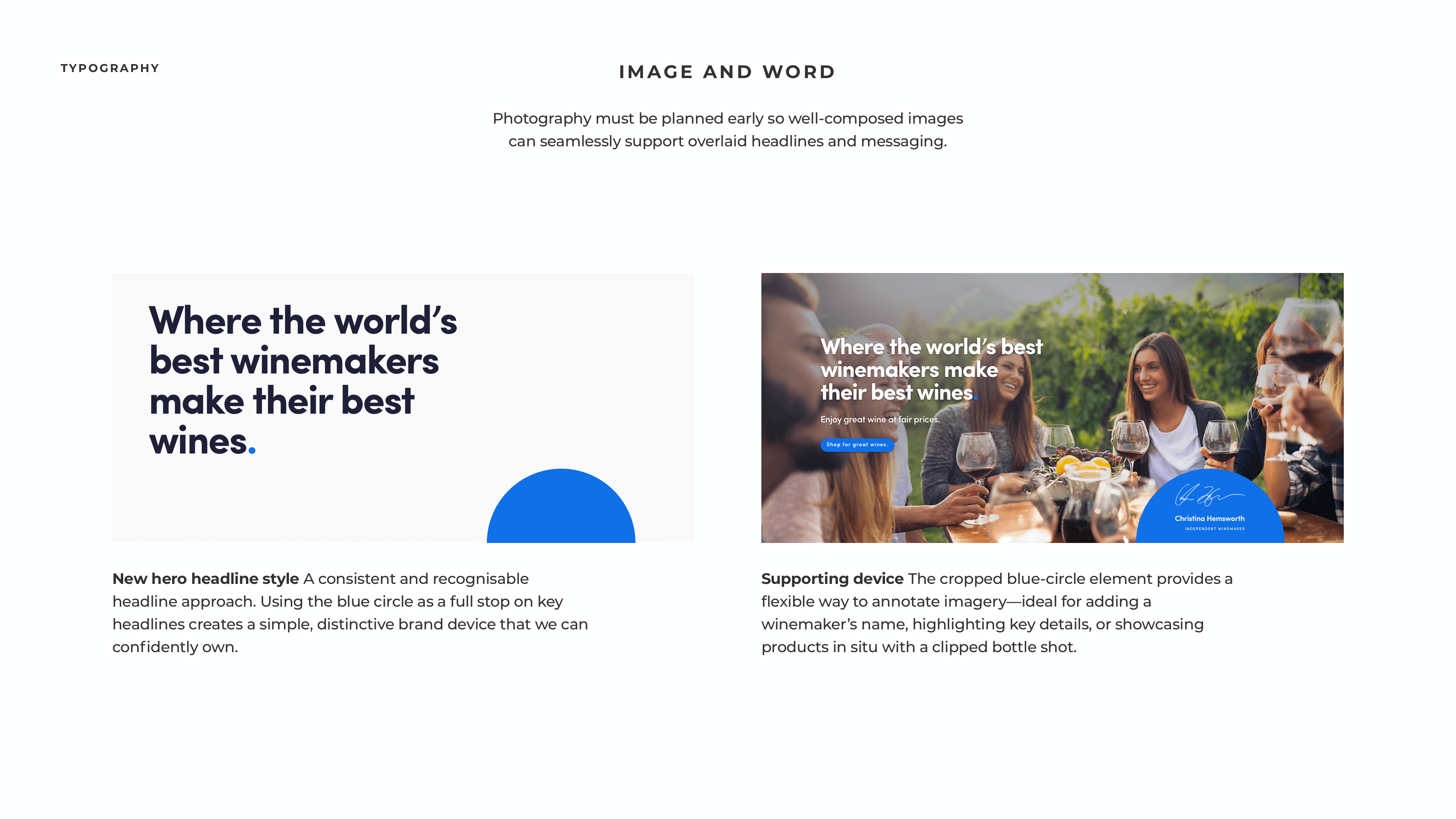
- Hero headlines style draws user attention
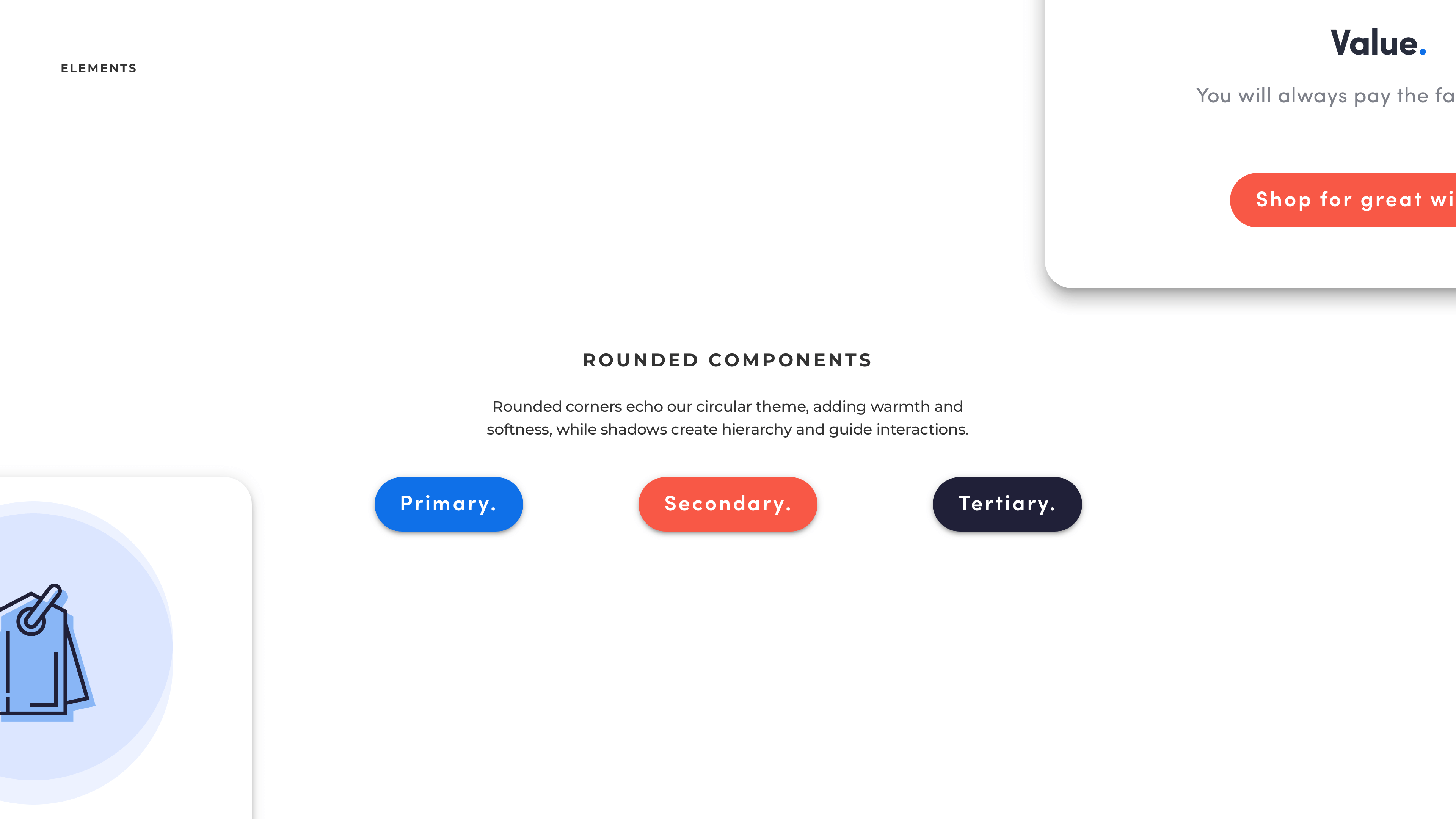
- Flexible UI elements adapt across layouts
- Versatile illustration style communicates brand personality
- Themed interface components reinforce design consistency
- Social media mockups showcase branded content
- Print media mockups extend brand presence
- Vibrant brand blue strengthens visual identity
- Supporting colour palette adds depth and harmony
- Consistent illustration palette ensures brand cohesion
- Updated fonts and type scale improve readability and hierarchy
- Hero headlines style draws user attention
- Flexible UI elements adapt across layouts
- Versatile illustration style communicates brand personality
- Themed interface components reinforce design consistency
- Social media mockups showcase branded content
- Print media mockups extend brand presence
Solution
Full-bodied Design
The outcome was a living design system. A scalable, accessible framework that connected brand strategy directly to product execution.
Core product journeys were redesigned to reflect the refreshed brand and introduce a more confident, expressive visual language:
- Proposition sign-up with clearer, benefit-led messaging
- A refreshed home experience with a more editorial, lifestyle-led feel
- Simplified product results and filtering for ease of use
Alongside this, an atomic design system was built in Sketch. Existing components were consolidated into a unified library, with clear structure, naming conventions, and accessibility improvements to meet WCAG AA standards.
The refreshed identity brought warmth and clarity to the experience, giving Naked Wines the confidence to express its values consistently across marketing and product.


- Hero layout combining messaging, imagery, and brand
- Overview cards highlighting the core proposition
- Champion layout showcasing awards and savings
- Split layout comparing brand bottle values
- Carousel showcasing the winemakers
- Proposition summary highlighting key benefits and CTA
- Logged-in landing screen with personalised taste recommendations
- Realistic product visuals with tasting cards
- Modular promo cards for flexible offers
Impact
Perfect Pairing
The work turned a high-level brand refresh into a practical, operational design foundation that teams could use with confidence.
By grounding strategy in tangible systems, Naked Wines gained a clearer and more expressive way to communicate its values, while improving how digital experiences were built and scaled.
The impact included:
- An operational design framework that brought brand thinking into day-to-day delivery
- Improved consistency, accessibility, and efficiency across teams
- A stronger, more human brand presence across product and marketing
“One route was interesting — the other was unmistakably Naked.”
— Liza Freudmann, Brand & Marketing
Reflection
Tastefully Refined
This project reinforced the importance of grounding strategic vision in real, usable systems.
By translating abstract brand principles into tangible design tools, Naked Wines gained more than a visual refresh. They gained a platform to express who they are with confidence and consistency, across both product and marketing.
It was a reminder that good brand work only succeeds when teams can actually use it.