Putting everything into practice
Webflow
A visual web development platform used to build responsive websites, CMS-driven content and scalable front-end experiences.
Context
Finding My Flow
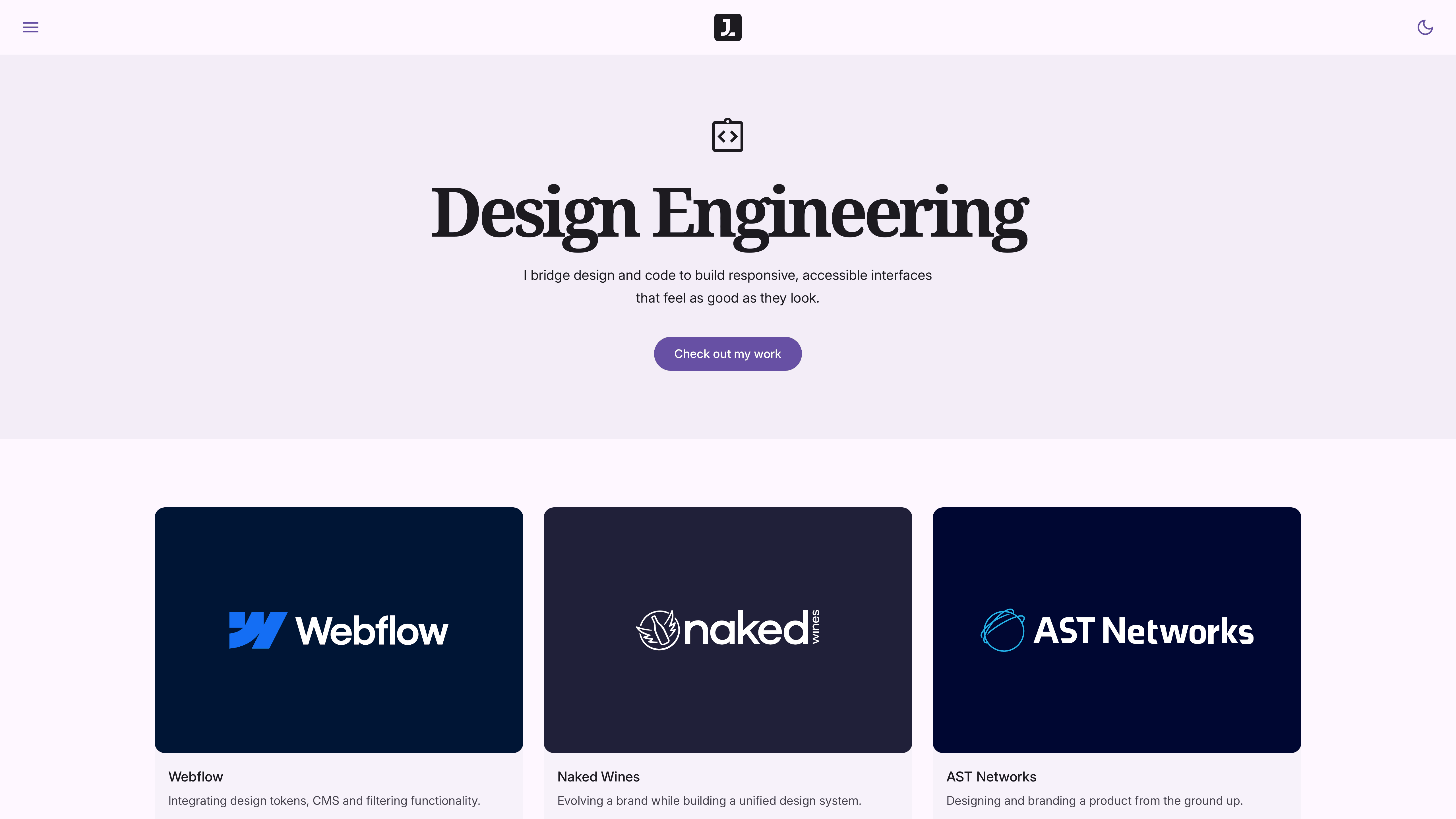
This portfolio was never intended to be a simple showcase of finished work.
It was treated as a product in its own right. A publishing system designed to present projects clearly, scale over time and remain flexible enough to evolve.
The challenge was to create something highly considered at every level. Not just visually polished, but properly structured underneath. Each case study needed to feel tailored while still sitting within a consistent system.
The goal was simple. Build a portfolio that could communicate work clearly, perform reliably across devices and remain maintainable long after launch.
Process
Setting Foundations
The build started with structure rather than visuals.
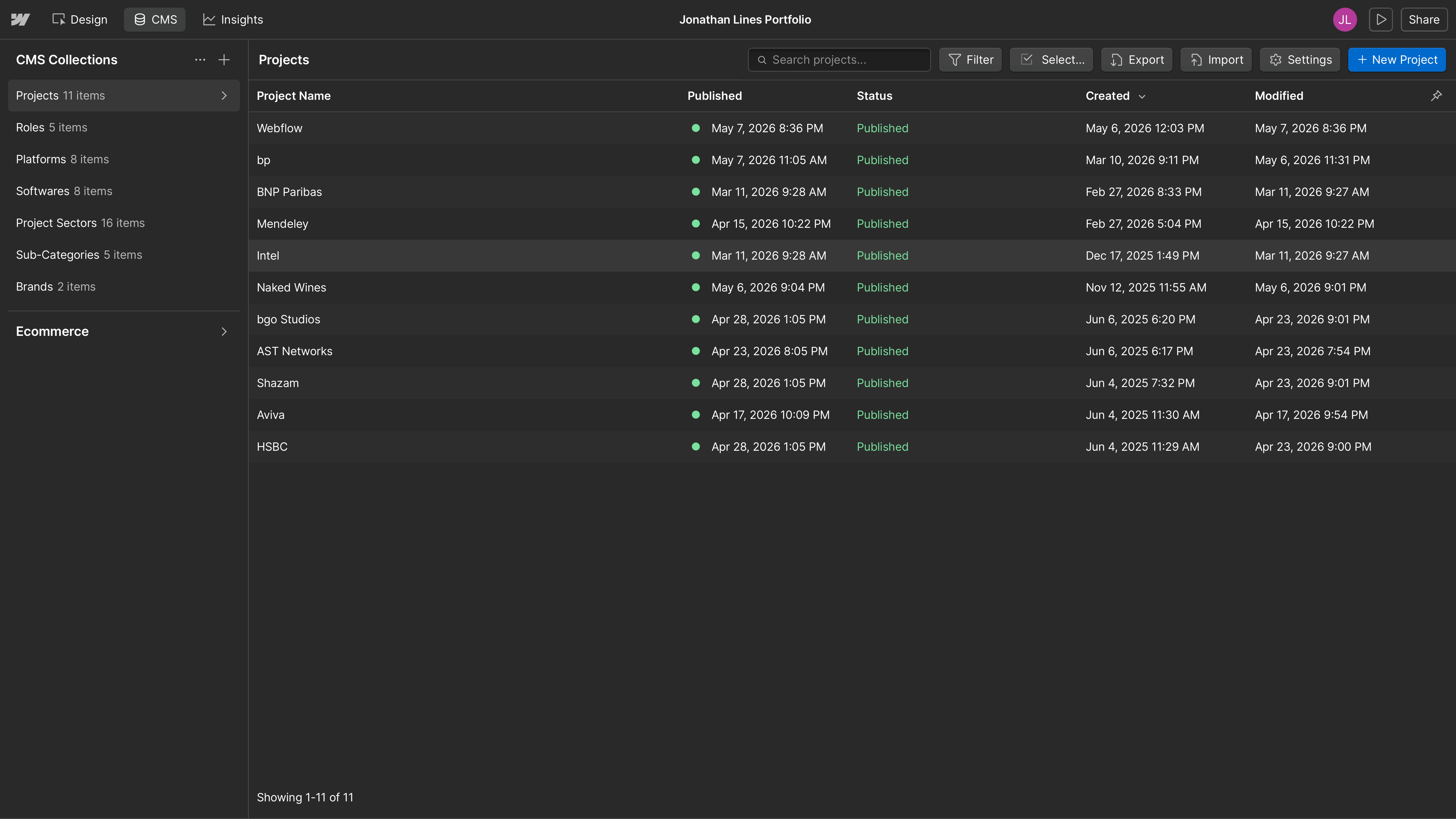
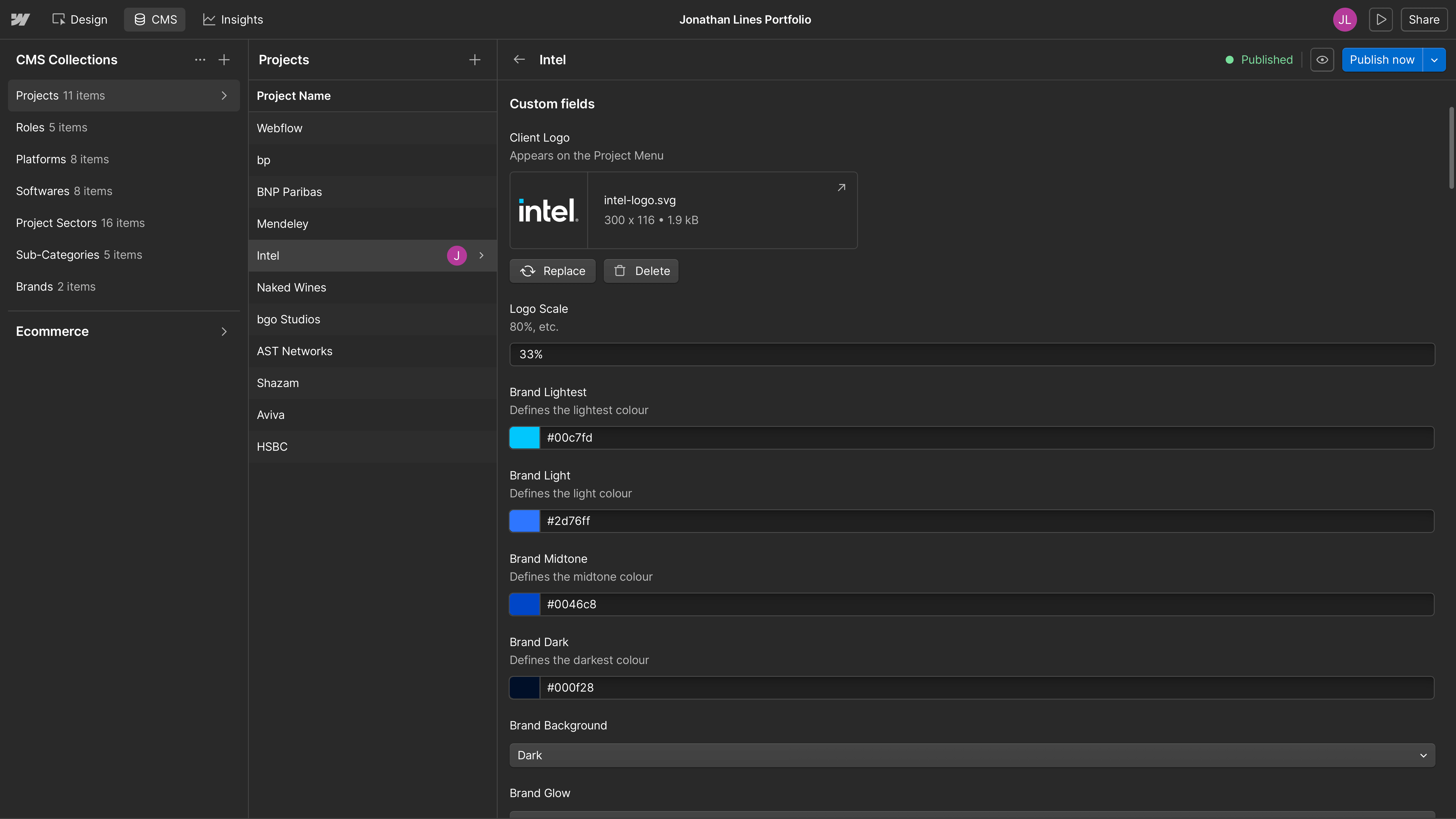
Using Webflow CMS templates, the portfolio was built from scratch around reusable content models. New projects could be added, themed and managed without rebuilding layouts.
A semantic design system was then created using Material 3 (Canonical) as the foundation. Following Google’s guidance closely, the system defined variables, design tokens, spacing logic, surface hierarchy and component behaviour from first principles rather than visual approximation.
Custom text stacks were developed to establish rhythm, readability and consistency, including typography choices, spacing behaviour and responsive scaling. Light and dark modes were built into the system from the outset rather than treated as alternate themes.
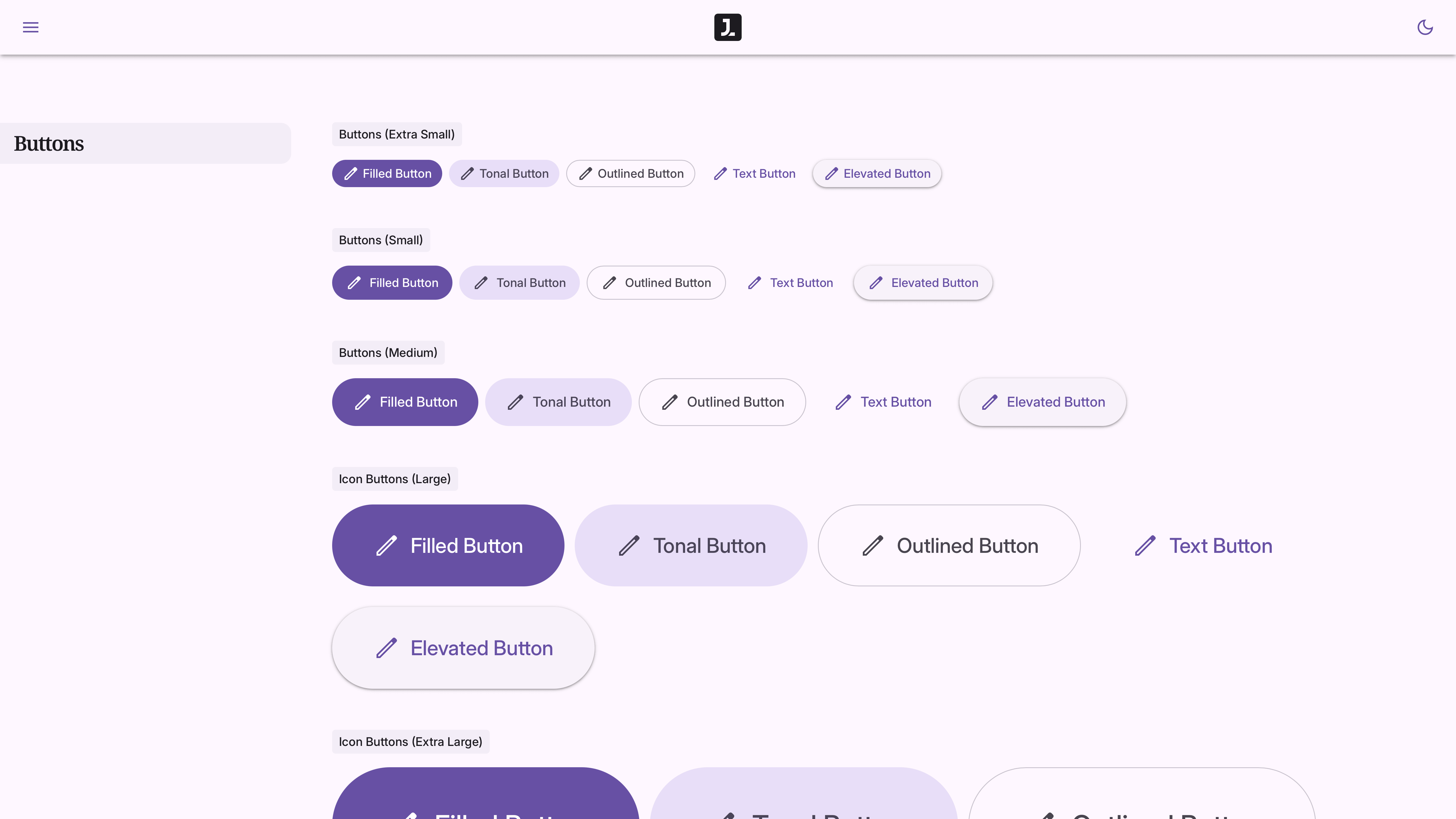
Stylesheet build examples
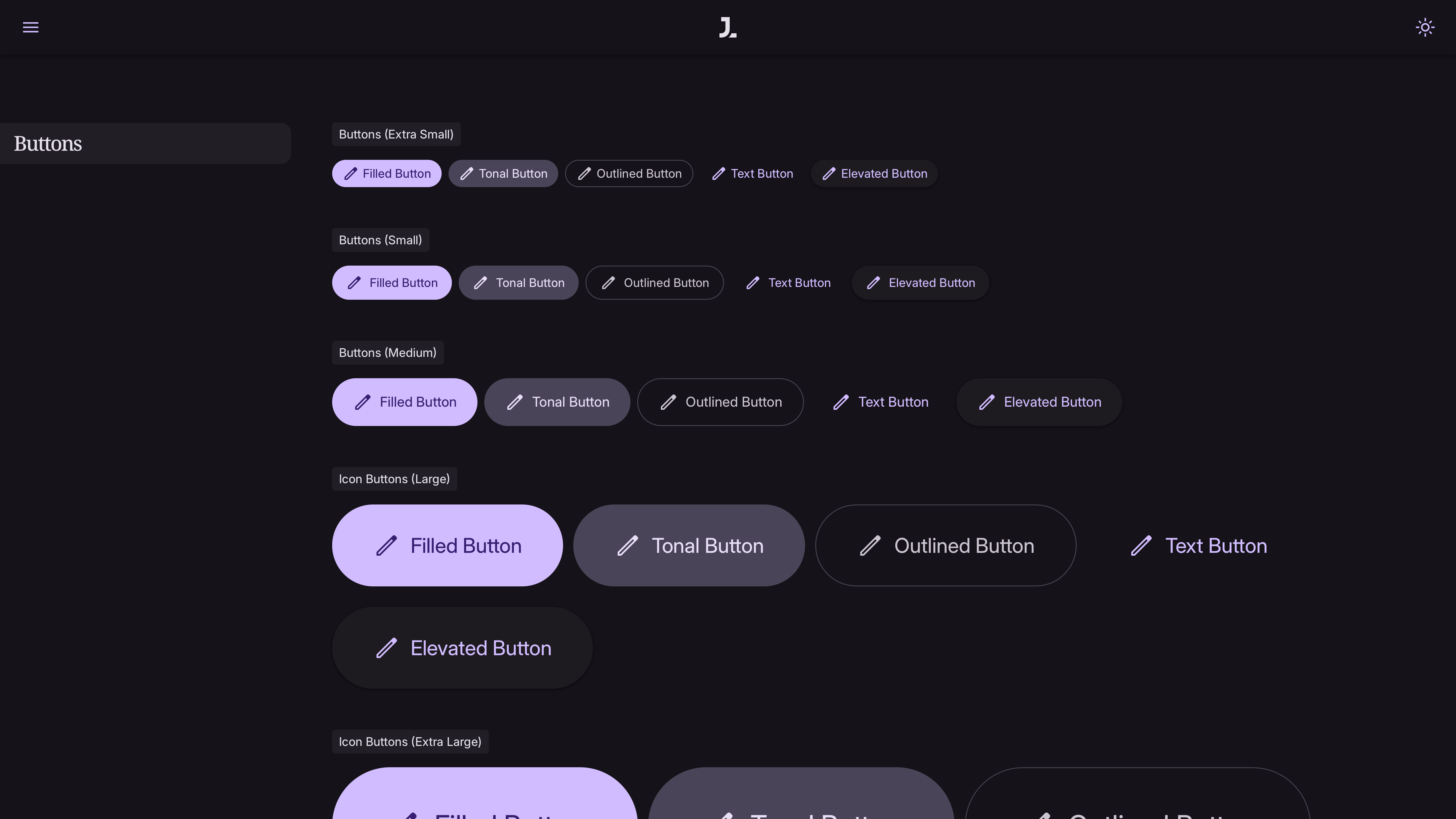
Stylesheet build examples
As the build evolved, custom front-end behaviour became a major part of the work. AI-assisted JavaScript helped accelerate more advanced implementation while design and code continued to be refined together.
“The goal was never just to make it look good. It had to be structured well enough to scale.”
— Jonathan Lines, Jon & On Ltd
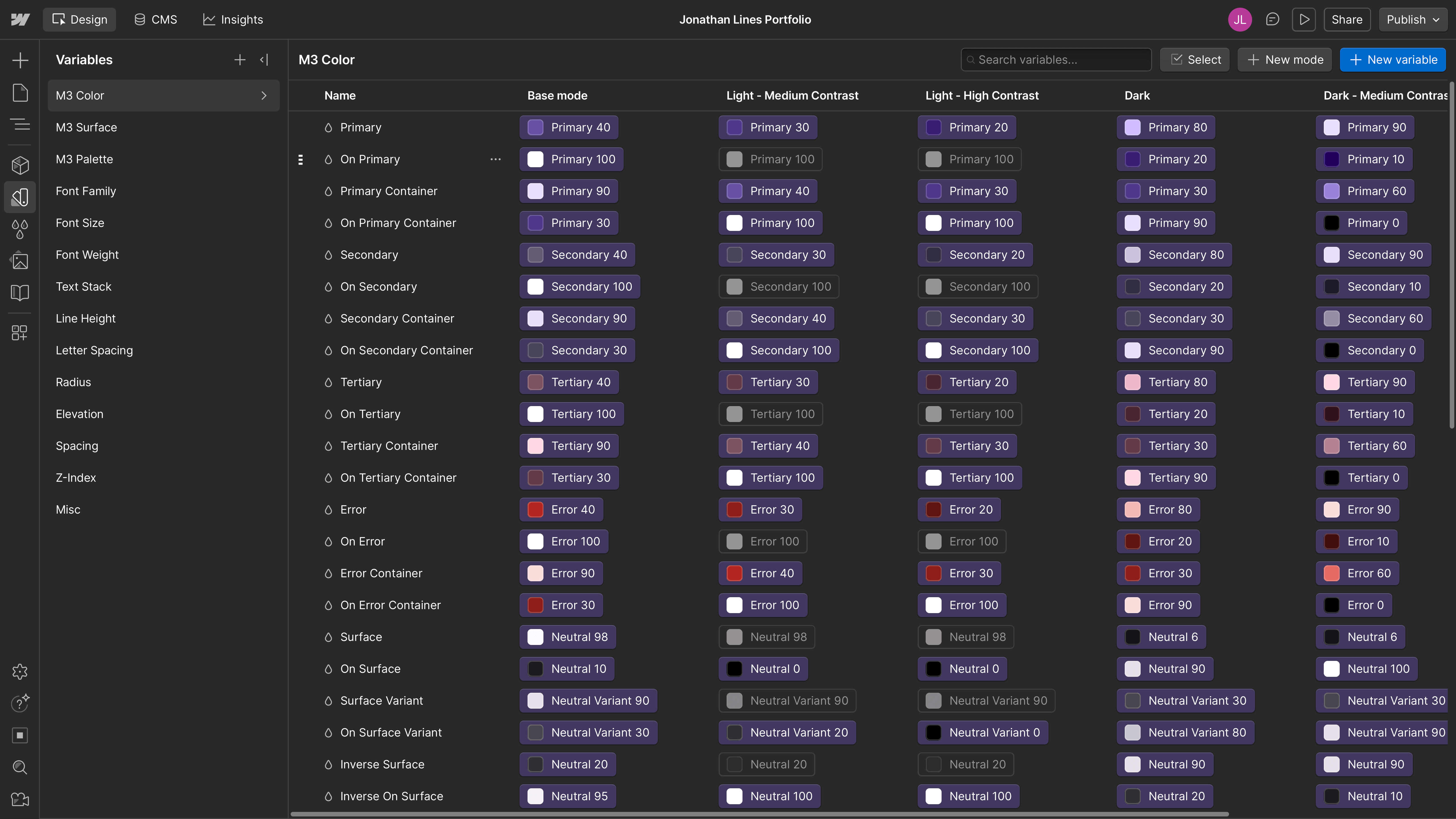
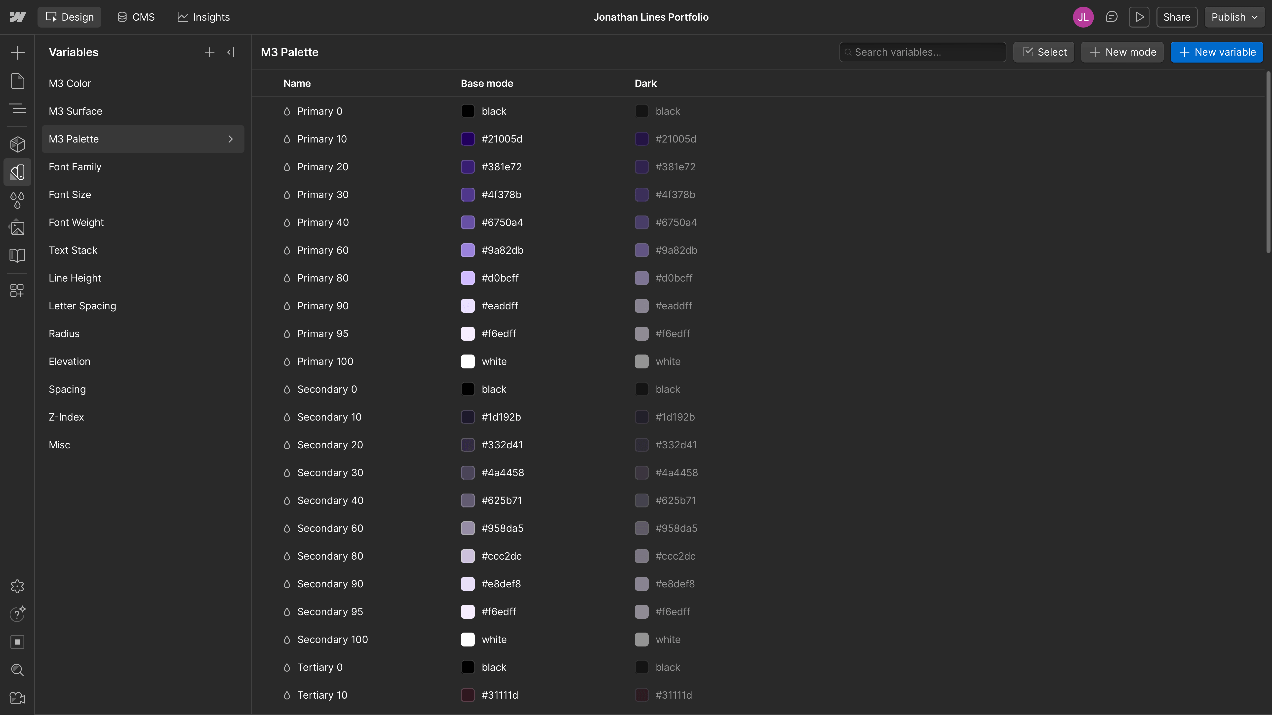
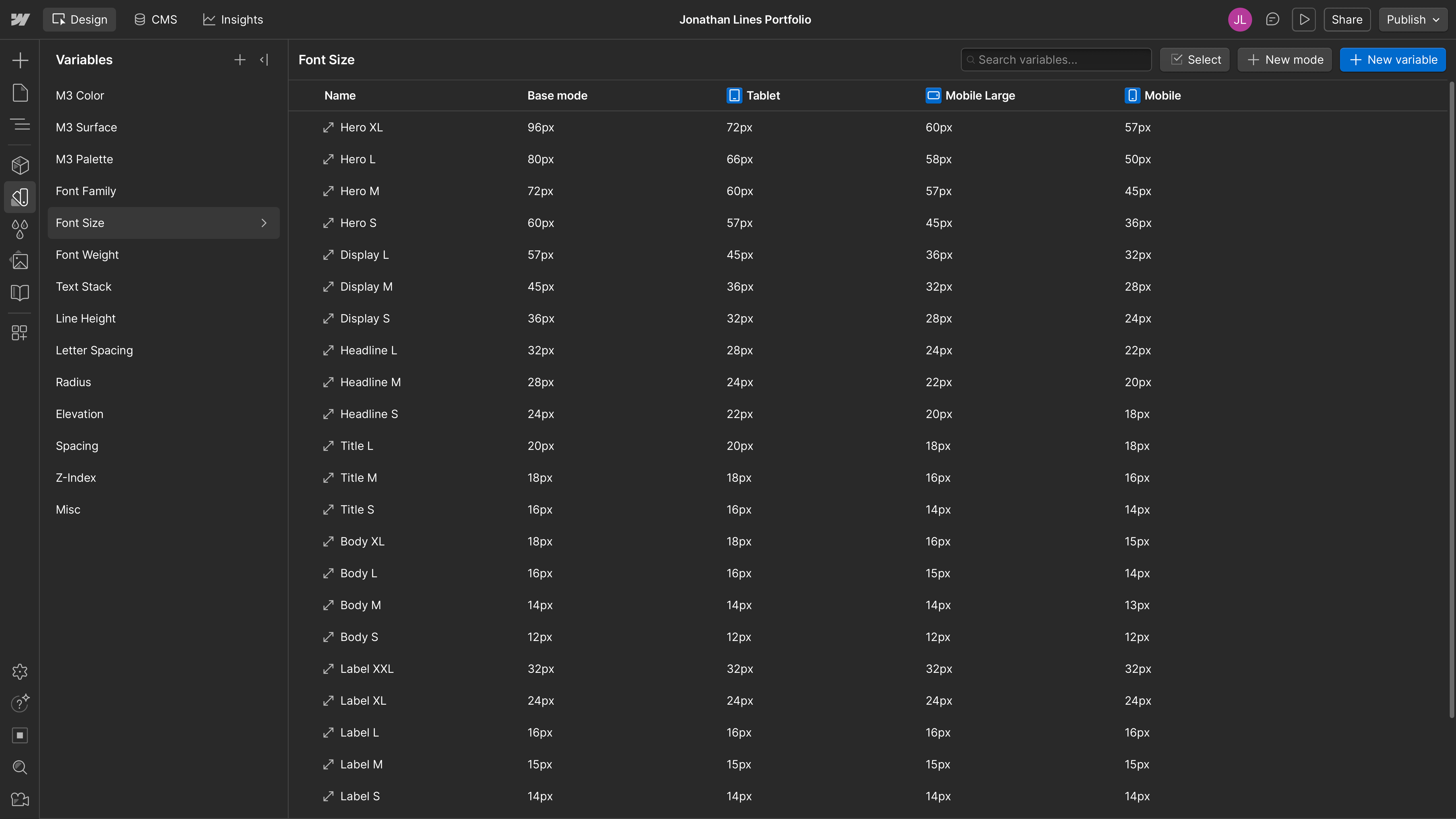
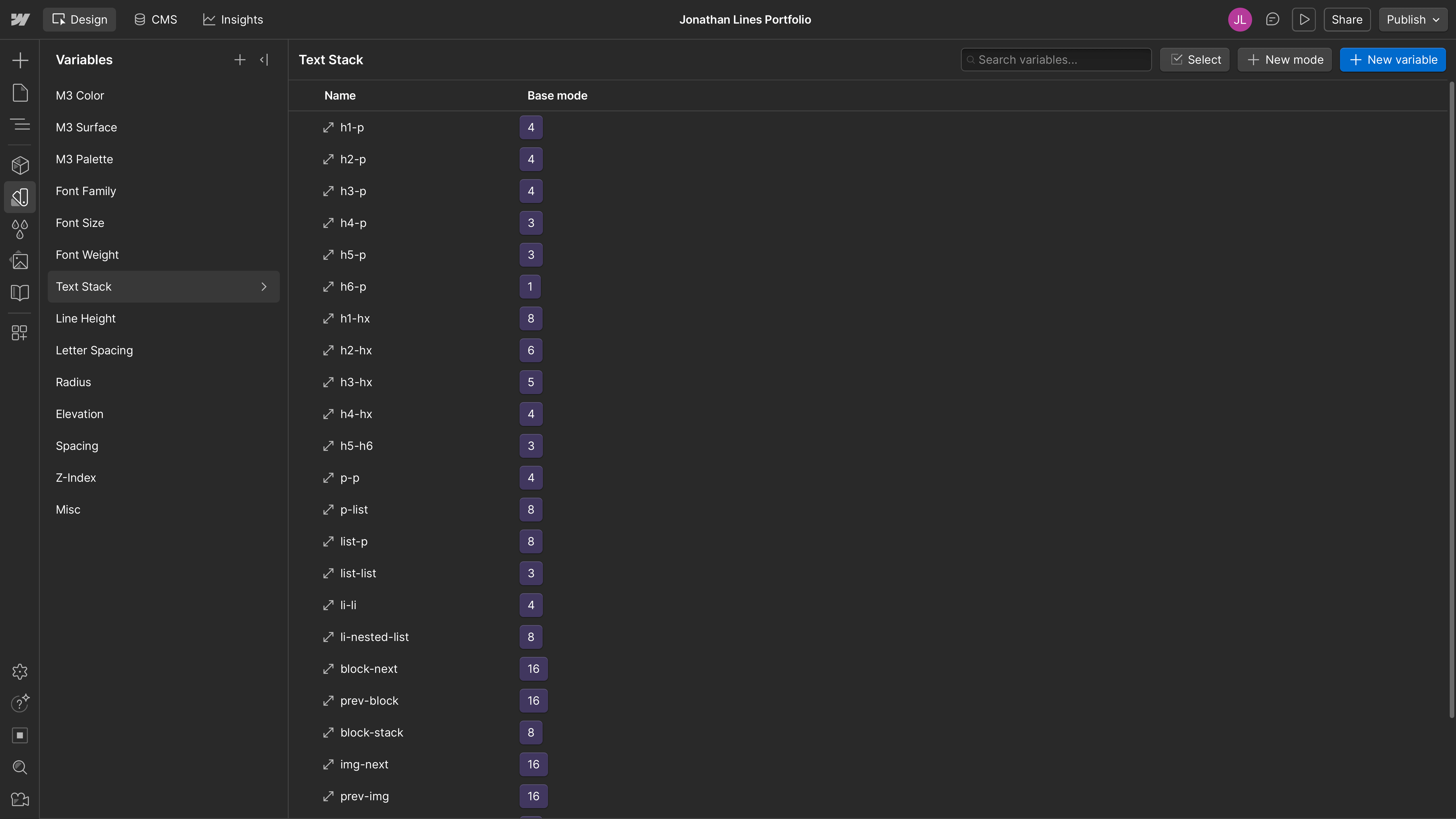
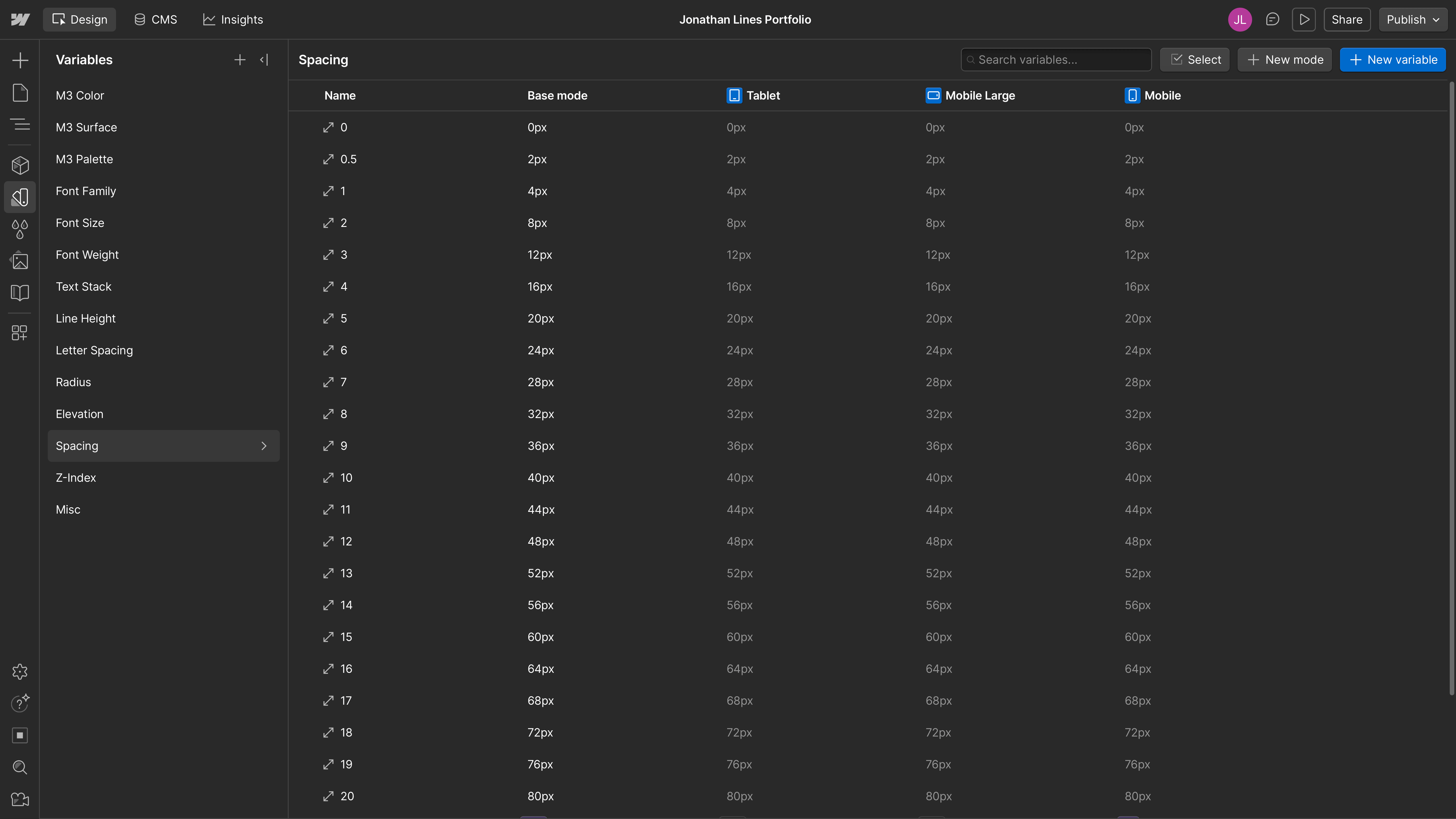
- Semantic colour system
- System colour palette
- Responsive type scale
- Text stack system
- Spacing system
- CMS collections
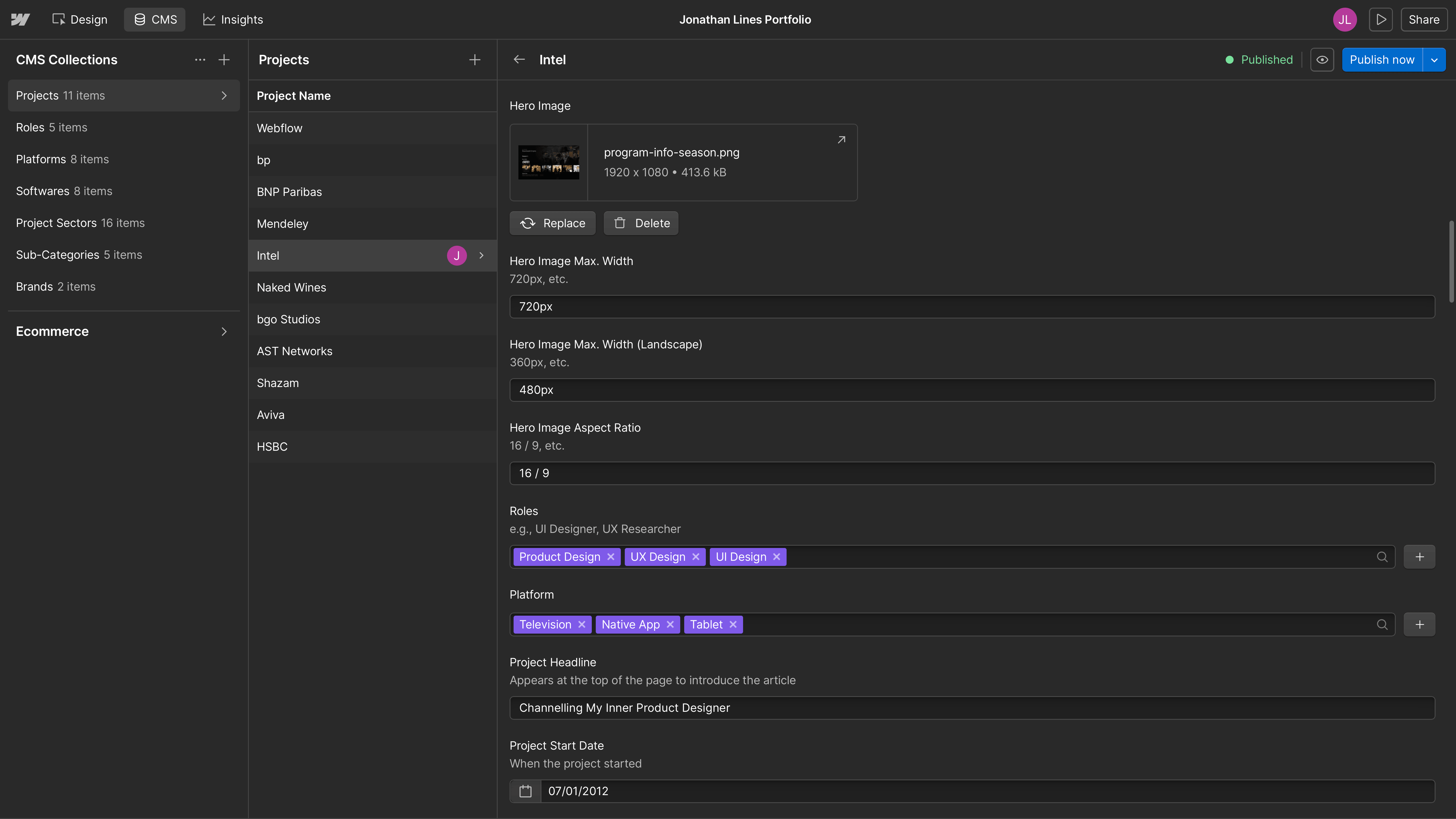
- CMS project theming
- CMS category tagging
Solution
Form Meets Function
While Webflow handled the CMS and layout foundation, much of the final experience relied on custom front-end implementation.
Key enhancements included:
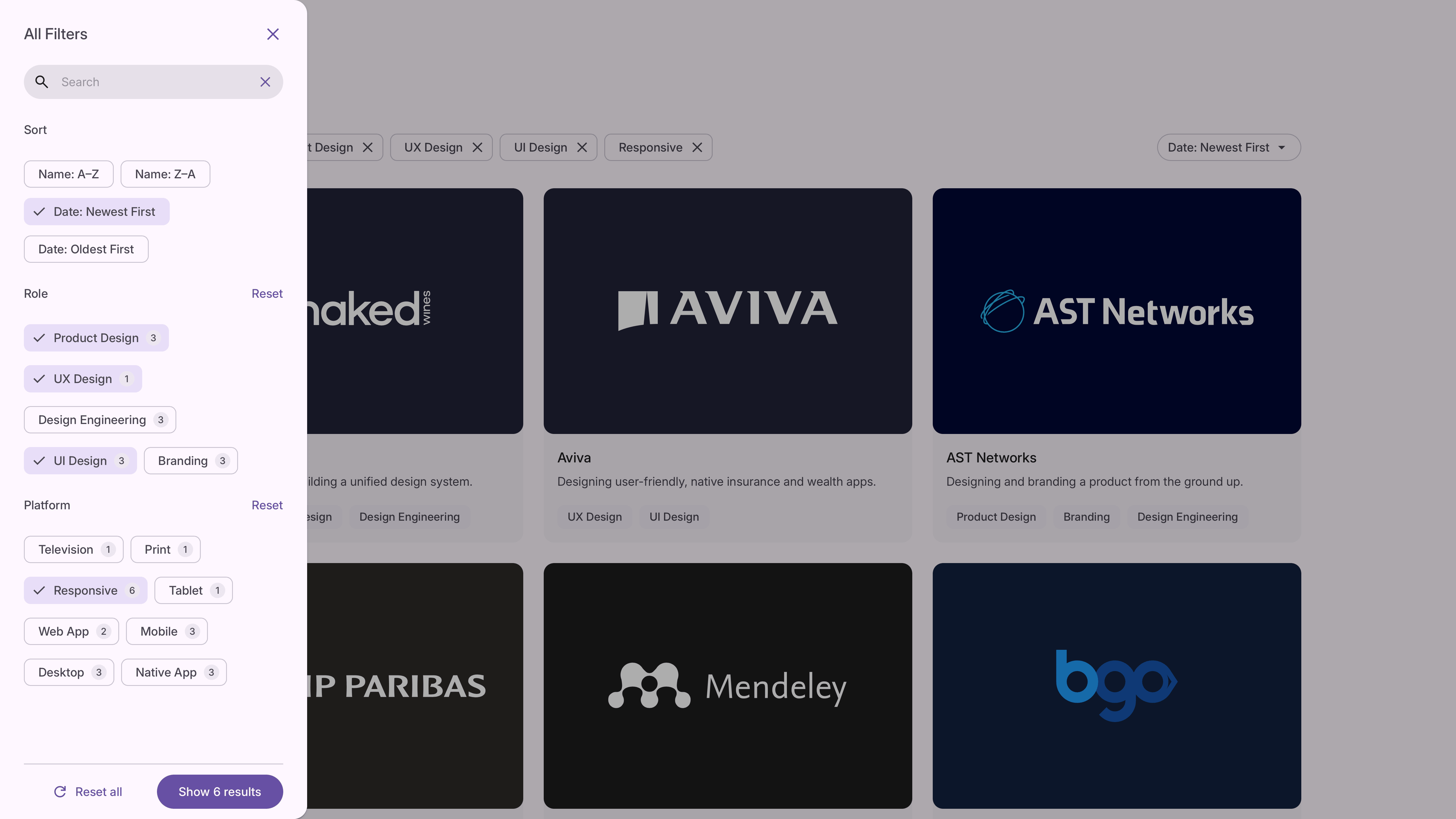
- Splide-powered lightbox image carousels with CMS-managed captions extracted from numbered list content for easier editorial control
- Text-fit behaviour for fluid headline scaling
- Case study reading-time estimation
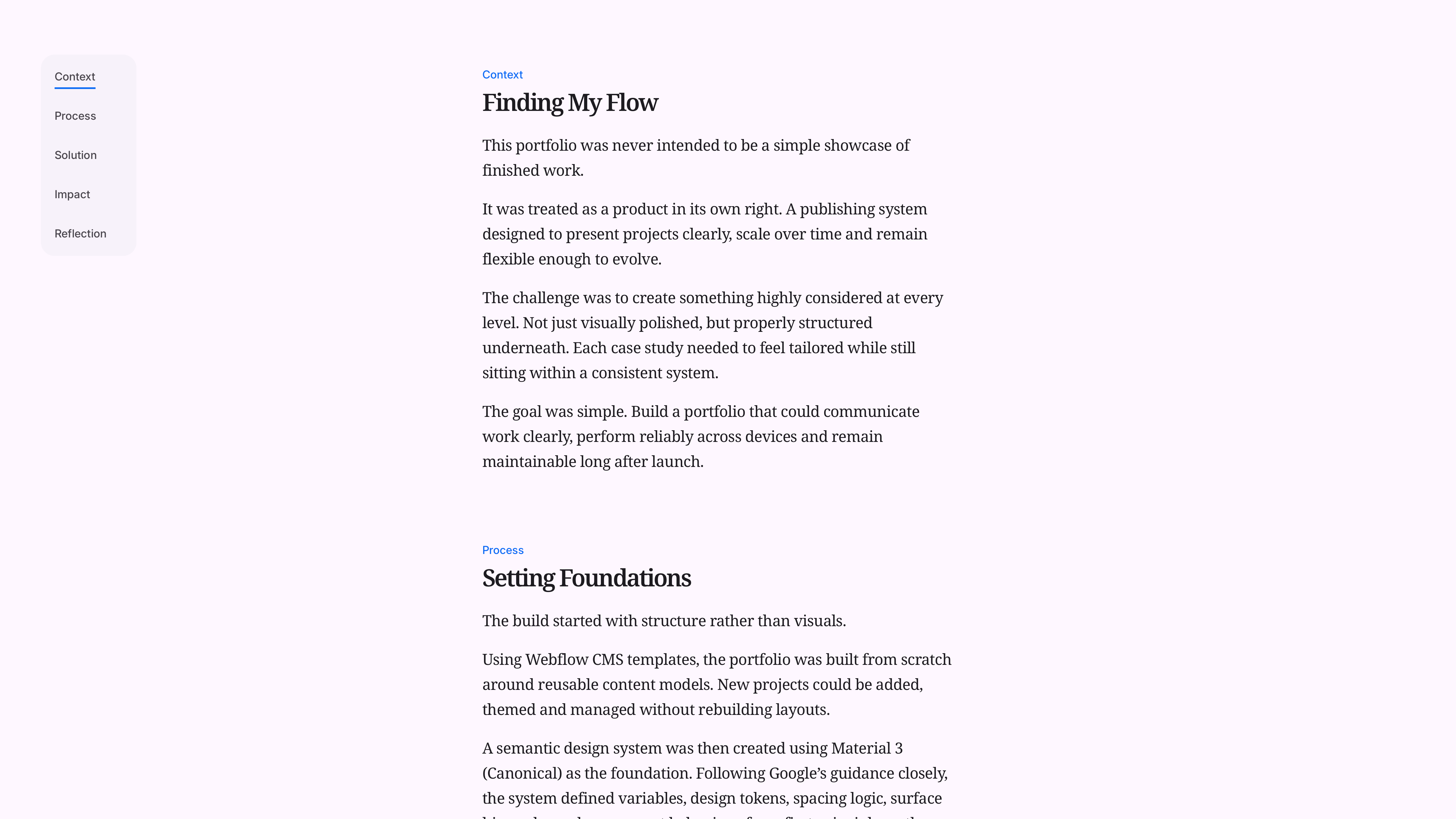
- Anchor-based table of contents navigation
- Customised Finsweet filtering logic and interaction behaviour
- Recreated Material-style pressed states and tactile interaction feedback
The build also involved custom HTML structure, code injection and bespoke CSS beyond what Webflow provides natively.
TYPOGRAPHY SPACING

/* Heading → paragraph / lists */
.text-stack h1 + p,
.text-stack h1 + ul,
.text-stack h1 + ol,
.w-richtext h1 + p,
.w-richtext h1 + ul,
.w-richtext h1 + ol {
  margin-top: var(--_text-stack---h1-p);
}

...
Case studies were made themeable through CMS-controlled variables, allowing each project to introduce controlled baseline CSS overrides while preserving consistency across the wider system.
Together, these additions turned a visual portfolio into a more flexible publishing platform.
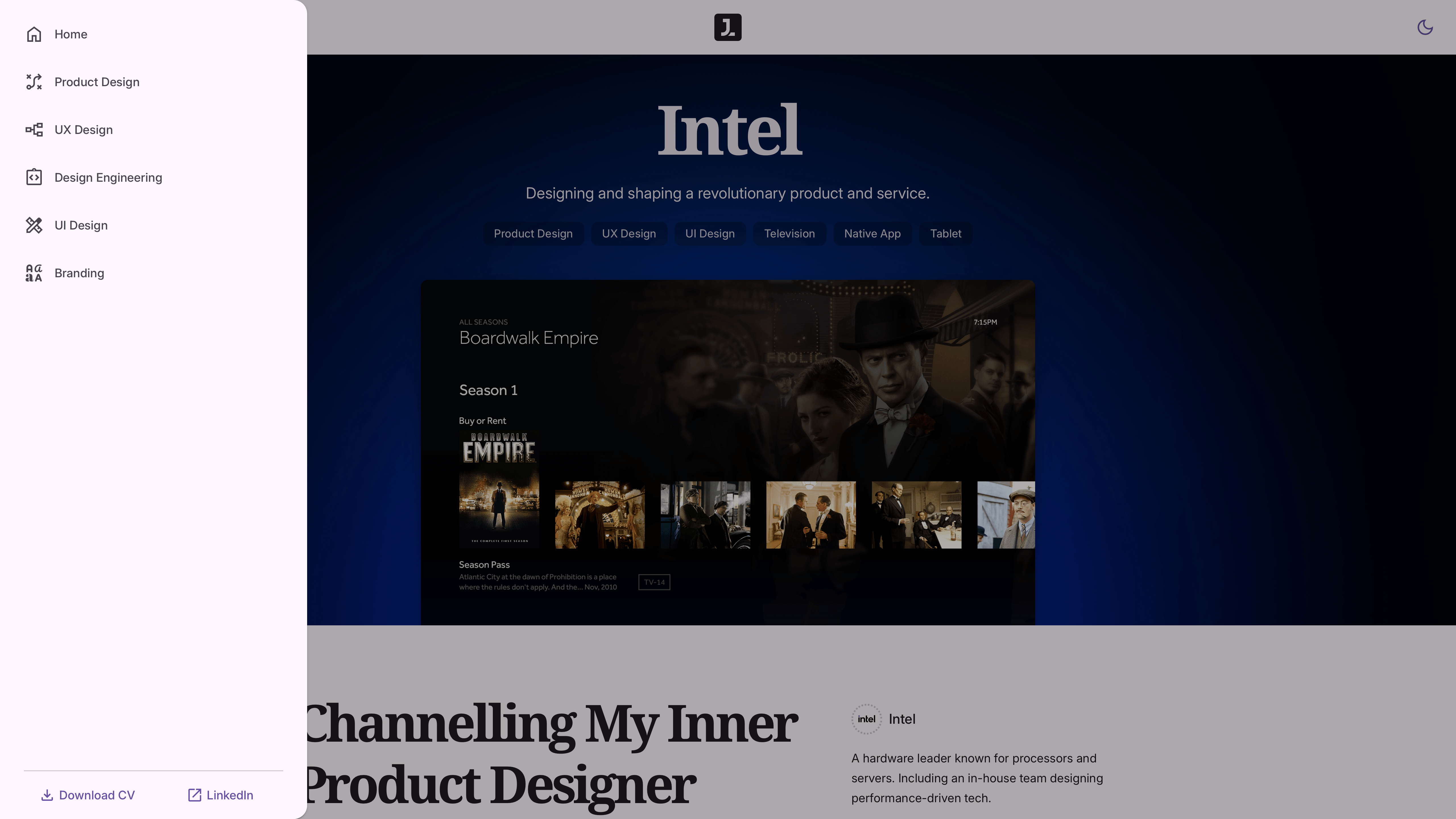
- Dynamic navigation drawer
- Project filter drawer
- Cross-sector project suggestions
- Responsive titles and read time
- Dynamic table of contents
Impact
Built to Scale
A large part of the work focused on the details that directly affect perceived quality.
Image behaviour was carefully controlled according to available space, aspect ratio and display density, including handling for @2x, @3x and @4x assets where appropriate.
Advanced CSS calculations, variables and layout techniques were used throughout to maintain visual balance across breakpoints, including mobile landscape orientation.
The CMS itself was structured with future white-labelling in mind. Rather than building only for personal use, it was designed as though other people would eventually manage it. Publishing logic was made predictable, scalable and difficult to break.
The result was clear:
- A reusable CMS publishing framework for future case studies
- A production-grade semantic design system built to Material 3 standards
- Fully responsive layouts with consistent behaviour across devices and orientations
- A platform flexible enough to evolve beyond a single portfolio site
“It stopped being a portfolio and started behaving more like a product.”
— Jonathan Lines, Jon & On Ltd
Reflection
Beyond Pixels
This project reinforced something I have come to value more and more. Polish is rarely about decoration.
It usually comes from structure, systems and attention to the details users do not consciously notice.
AI was used throughout the project to help refine sentence structure, improve readability and accelerate parts of the front-end build, but the judgement remained human. The job stayed the same: make the product clearer, more coherent and easier to use.
What started as a portfolio became a practical exercise in design systems, front-end problem solving and CMS architecture.
In many ways, that made it one of the most complete product design projects in the portfolio.