Taking Online Gaming to the Next Level
bgo Studios
An online casino known for its bingo, slots and table games. Including an in-house team creating games for the platform.
Context
Dealt a Tricky Hand
I joined bgo at a moment of personal and professional change. Newly relocated, newly single, and stepping into an industry I hadn’t worked in before.
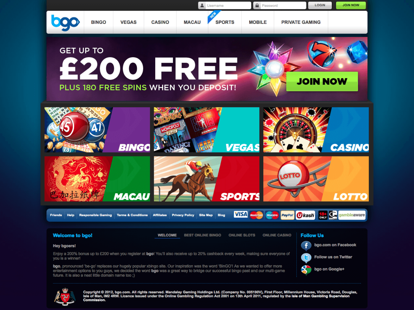
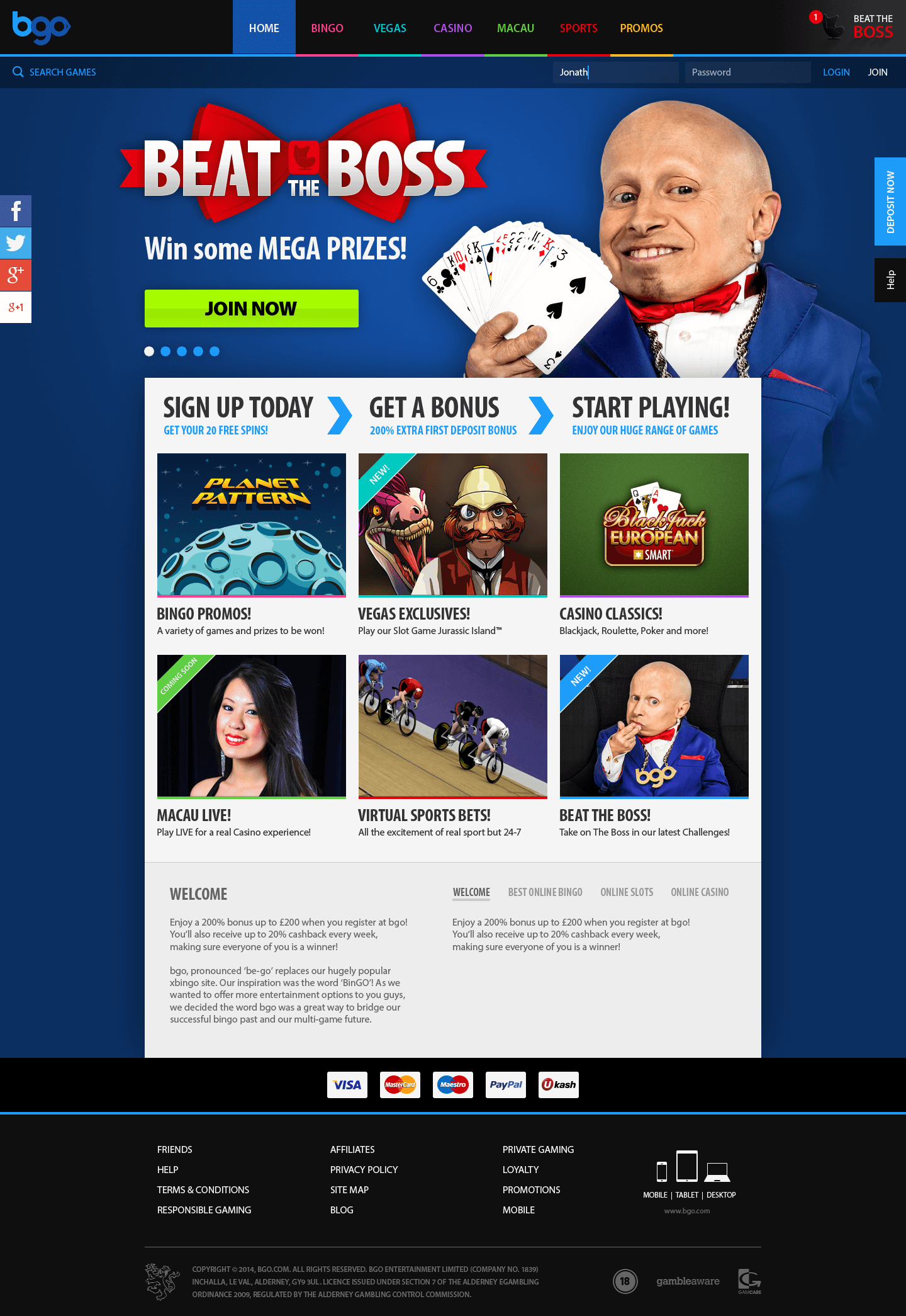
The product itself was struggling. Built in Flash, the platform felt dated and fragile. Pop-ups were blocked, accessibility was poor, and users were dropping off before placing their first bet. In a crowded, fast-moving market, the technology was actively working against the business.
The brief was clear. Modernise the experience, improve accessibility, and give new users a reason to stay.
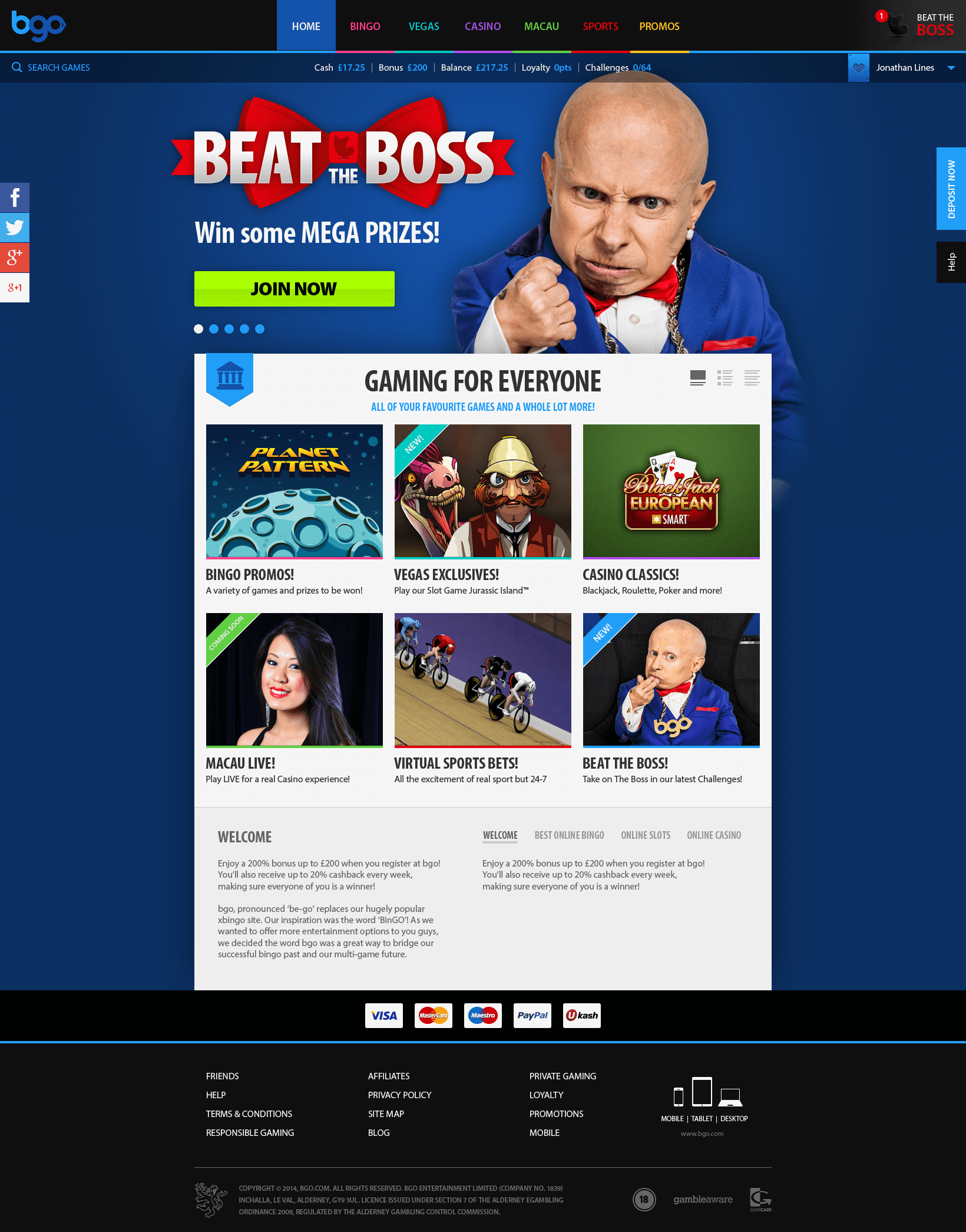
Home screen
[GROUP:Compare]
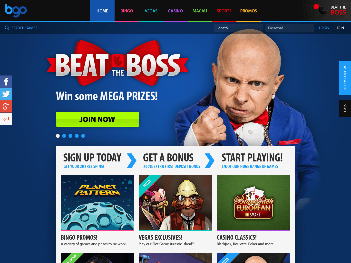
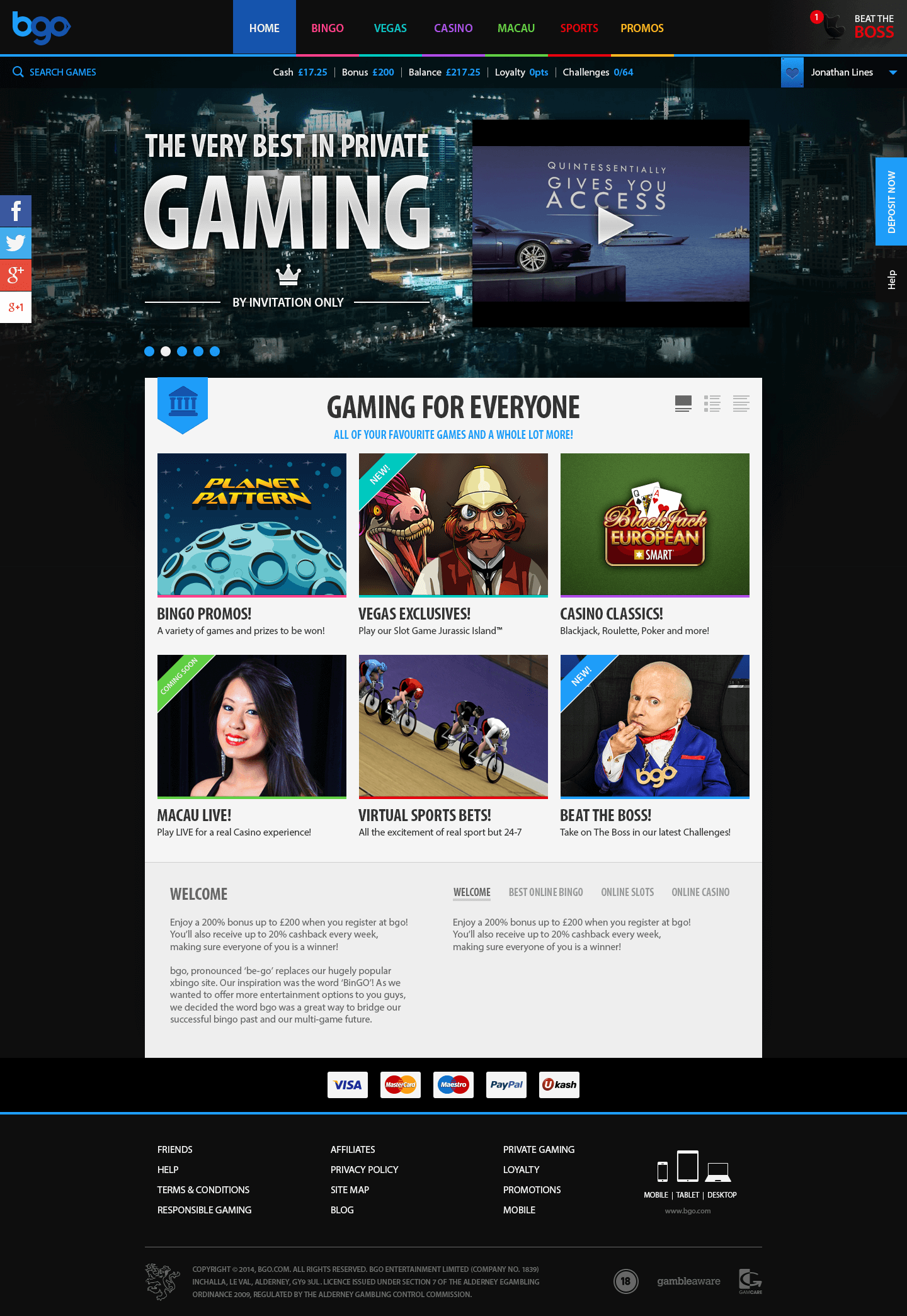
Home screen redesign
[GROUP:Compare]
Process
Doubling Down on UX
Early on, it became clear the platform’s Flash foundation was limiting what the experience could be. After discussions with engineering, a proposal was formed to migrate the site to HTML5.
Once approved, the focus shifted to reducing friction and rebuilding trust. The work centred on auditing the experience, improving accessibility, and creating a visual system that felt modern and reliable.
Sign-up was rebuilt into progressive steps to reduce abandonment. Navigation was simplified, iconography was made consistent, and a clear style guide was created to support reuse. Design and development moved closely together, with regular stakeholder reviews to keep momentum and alignment.
“Wait a minute! You've automated all forty-eight banners, so we don't have to create them individually anymore?”
— Paul Fitchford, Casino Manager
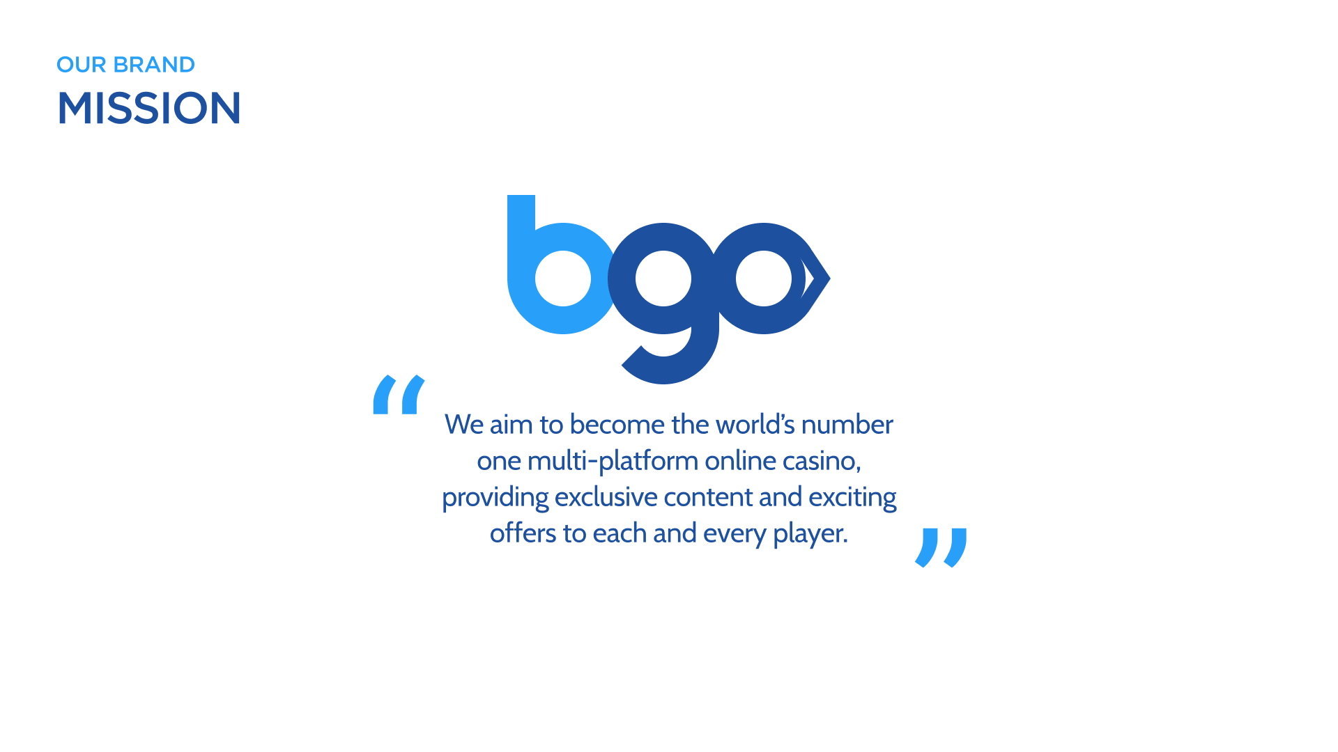

- Defined a mission statement with the business
- Set the brand Tone of Voice
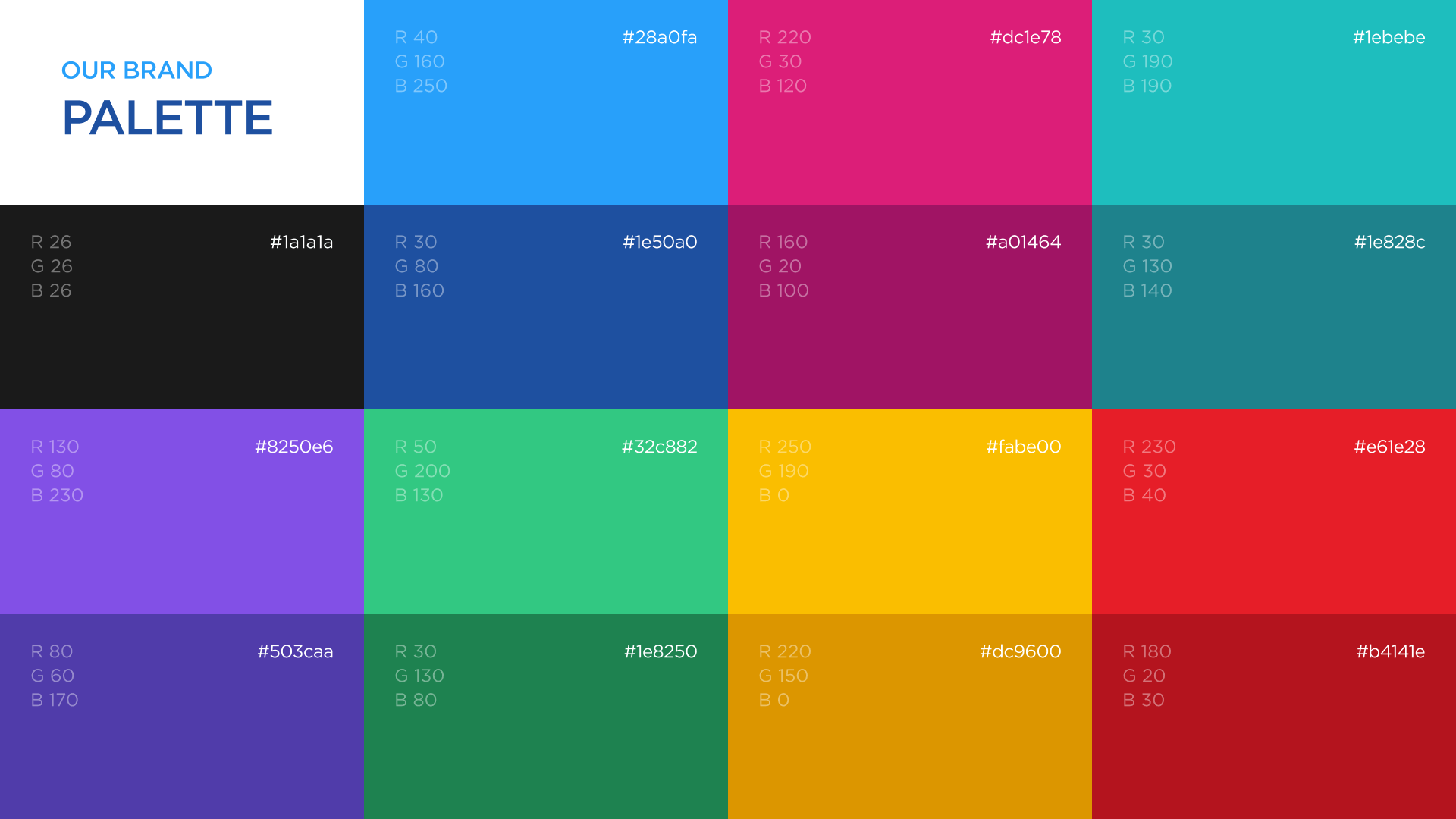
- Created an accessible colour palette
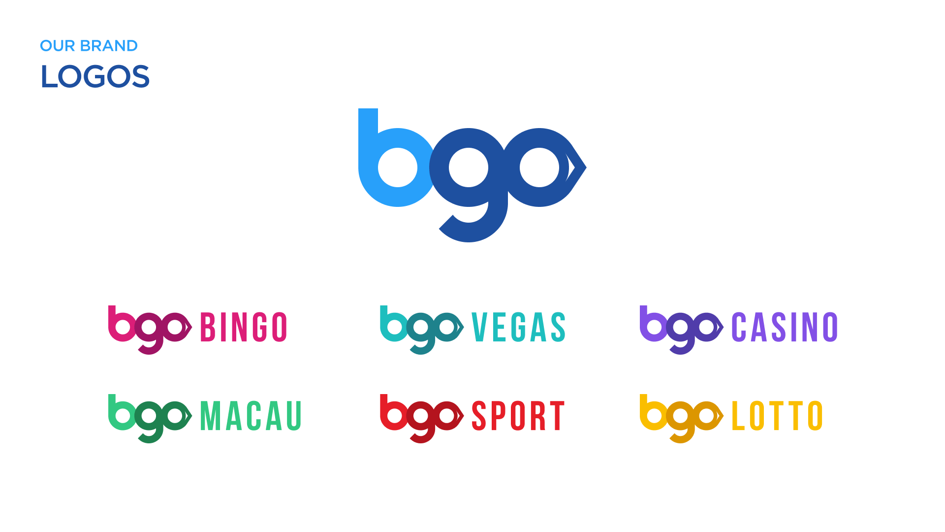
- Optimised brand and gaming category logos
- Defined a mission statement with the business
- Set the brand Tone of Voice
- Created an accessible colour palette
- Optimised brand and gaming category logos
Solution
All In on Design
The UI was overhauled to replace a dated, inconsistent experience with one focused on simplicity, trust, and accessibility.
Key improvements included:
- Clearer visual hierarchy using whitespace, headings, and simplified layouts
- Improved typography and colour contrast aligned with WCAG 2.0
- A flexible component system covering core UI patterns
- Refined mobile layouts, particularly navigation and sign-up
- Trust signals through microcopy and visual cues during account creation
Together, these changes modernised the platform and reduced friction at the moments that mattered most.
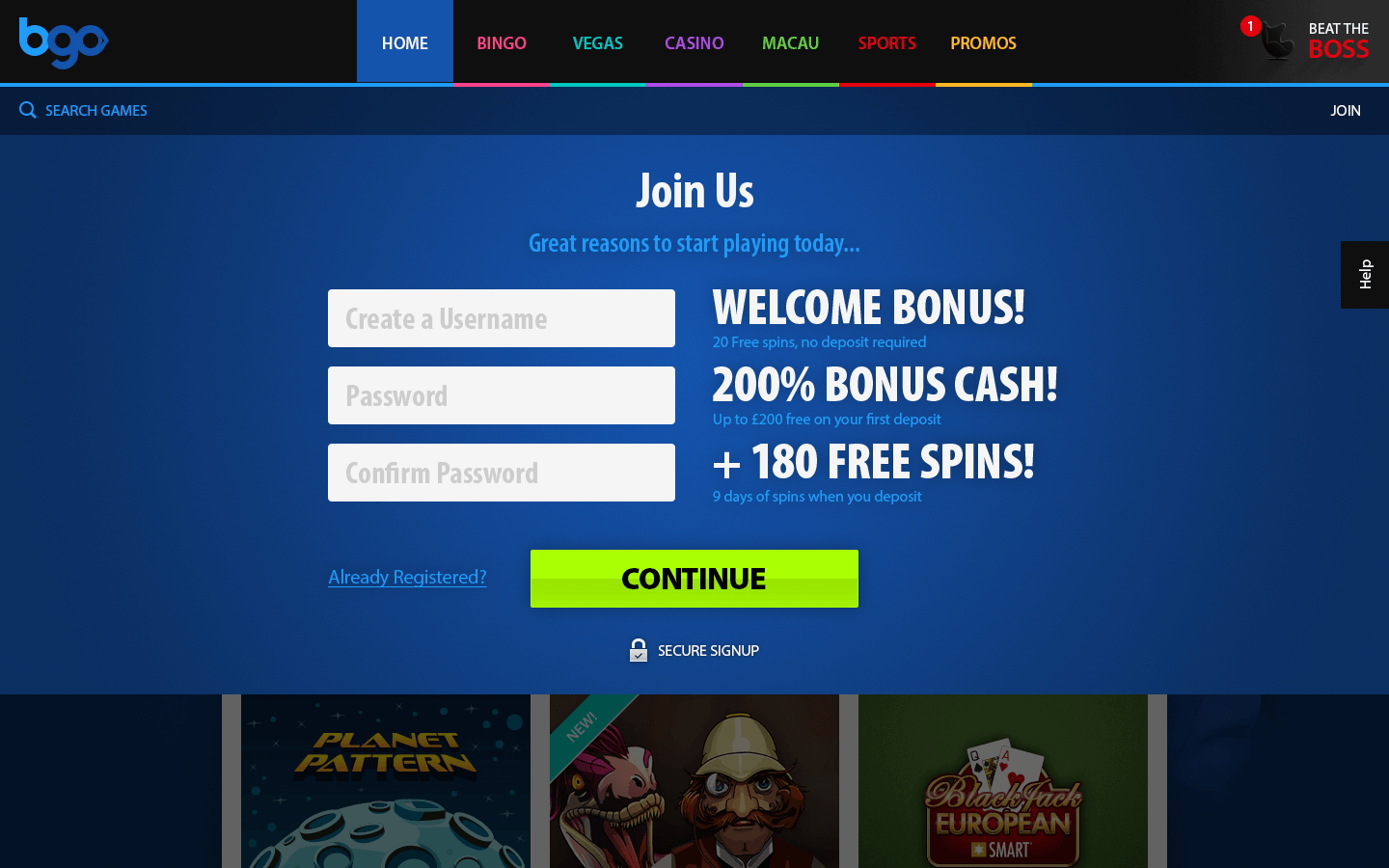

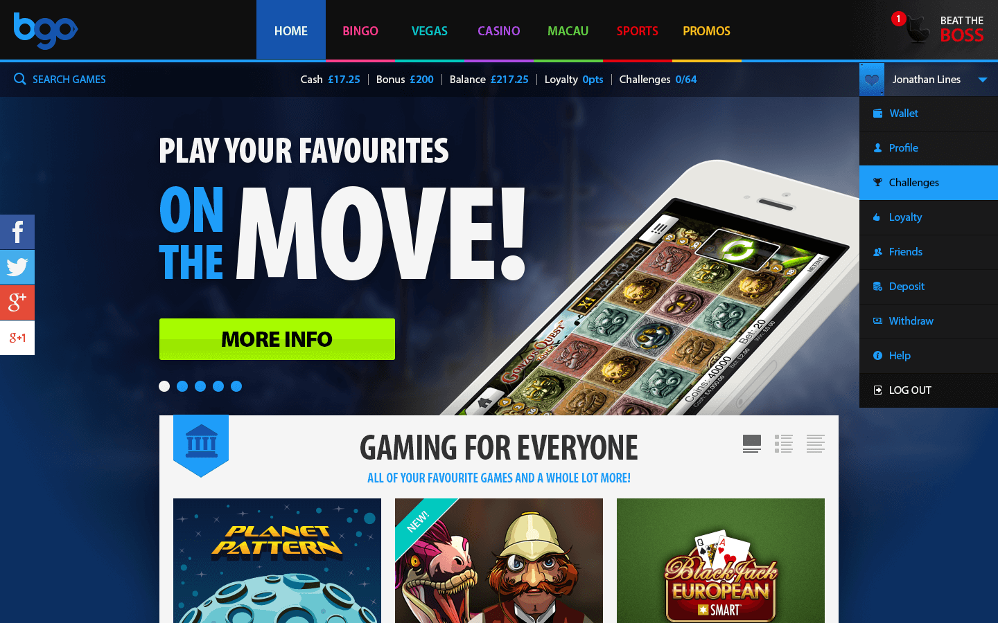
- New step-by-step sign up process
- Tooltips to support the user journey
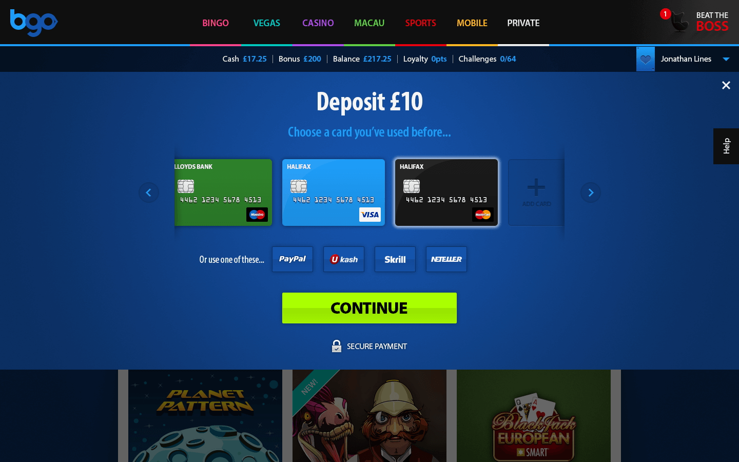
- Quick deposit feature for ease of use
- A more accessible responsive Home screen
- Themed landing screens to clearly define categories
- Dedicated VIP, high roller experience
- Quick access account menu
- New step-by-step sign up process
- Tooltips to support the user journey
- Quick deposit feature for ease of use
- A more accessible responsive Home screen
- Themed landing screens to clearly define categories
- Dedicated VIP, high roller experience
- Quick access account menu
Impact
When the Chips Are Down
The refreshed experience improved accessibility, trust, and performance across the platform.
Logo colours were refined to meet WCAG 2.0 AA standards across light and dark backgrounds. New sign-up flows were tested internally, with customer feedback monitored through the call centre and social channels.
The results were clear:
- Customer registrations increased, reaching record highs
- A unified visual language improved brand recognition and trust
- Migration from Flash to HTML5 future-proofed the platform and improved stability across devices
“Wow! Our sign-up conversions have almost doubled since we deployed the updates!”
— Jake Fox, Head of Product & SEO
Reflection
The House Always Wins!
This project was a reminder that design isn’t just about pixels. It’s about asking better questions, listening to users and developers, and being willing to challenge the brief when something doesn’t feel right.
I joined bgo as a visual designer, but by stepping beyond my original scope and collaborating closely across teams, I helped drive a full platform transformation.
Even without the best hand, we played it just right.