Striking the Right Chord with iOS 7
Shazam
A music recognition app which identifies songs. Based in London, now part of Apple, with core development still based in the UK.
Context
Changing the Tune
Shazam was already a household name, but the product was at a turning point.
The interface leaned heavily on skeuomorphic patterns that were starting to feel dated. At the same time, Apple was preparing the launch of iOS 7 and approached Shazam to adapt the app as a flagship example of the new design language.
Alongside this, Shazam was expanding into TV advertising and exploring new features like streaming integrations and always-listening modes. It was the right moment to modernise a cultural icon and help set the product up for its next phase of growth.
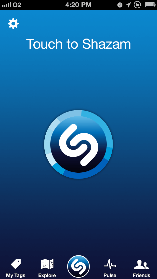
iOS 6 – Skeuomorphic
[GROUP:Compare]
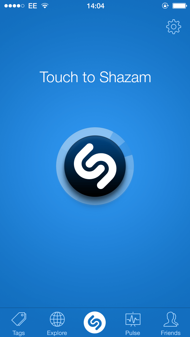
iOS 7 – Flat redesign
[GROUP:Compare]
Process
Listening With Intent
The visual refresh spanned both Shazam and Shazam Red, with the added complexity of meeting Apple’s iOS 7 requirements while working within an engineering-led culture.
Skeuomorphic UI was reworked into a clean, flat system aligned with iOS 7. New features shifted Shazam from a reactive tool into a more proactive experience, including always-listening and integrated music playback.
The work also extended into live TV campaigns and App Store presentation, with detailed redlines and asset packs delivered across multiple variants. Designing under NDA meant precision mattered. Every detail had to meet Apple’s standards, and trust with developers was built through consistency and clarity.
“Jon’s designs made us rethink what Shazam could be. He brought speed, accuracy, and respect for development that won the whole team over.”
— Charles Henrich, Head of Development, Shazam


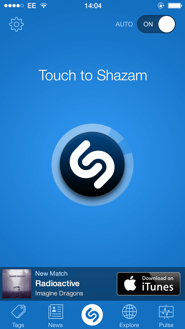
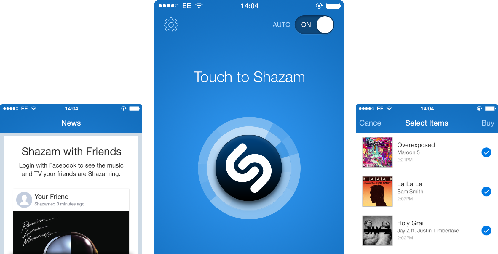
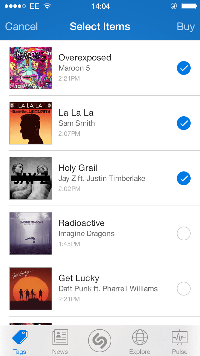
- Modernised iOS 7 home screen
- Refreshed listening view
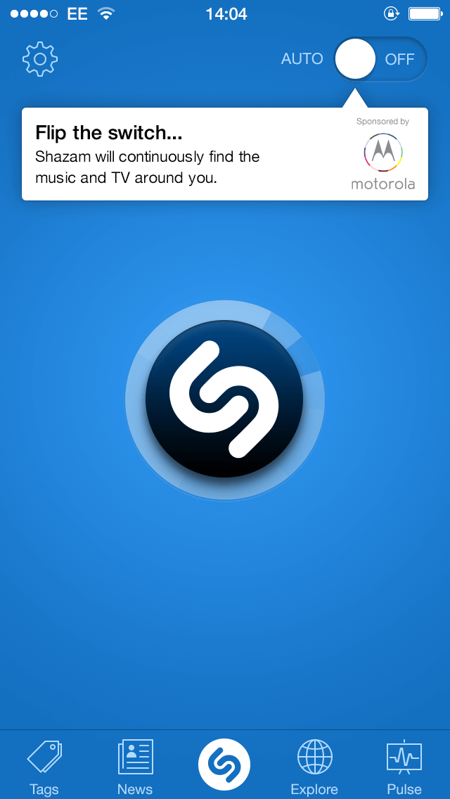
- Auto feature onboarding hint
- Sponsored Auto mode integration
- Updated match result view
- Modernised iOS 7 home screen
- Refreshed listening view
- Auto feature onboarding hint
- Sponsored Auto mode integration
- Updated match result view
Solution
Designs That Resonate
The refreshed app balanced innovation with polish, aligning Shazam with iOS 7 while expanding its role beyond music recognition.
The solution delivered:
- A flat, minimalist UI consistent with iOS 7 design principles
- Always-listening mode for seamless background song detection
- Rdio streaming integration within the app
- Support for TV advertising campaigns and live promotions
- Parallel releases of Shazam and Shazam Red, with assets optimised for speed
This repositioned Shazam as a modern, forward-looking platform without losing its core identity.
“Looking fresh! Working Fast! Shiny and fresh, Shazam looks new again.”
musicman230, iOS App Store ★★★★★


- New in-app news feed
- Social sign-in for friend activity
- Friends’ activity posts
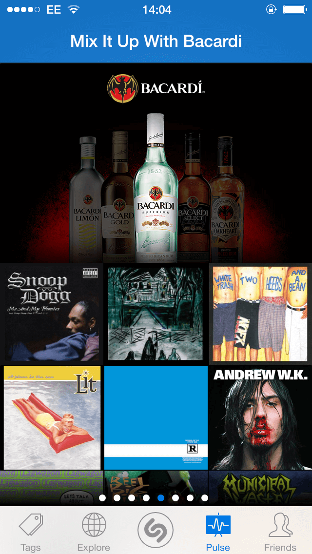
- Branded playlist integration
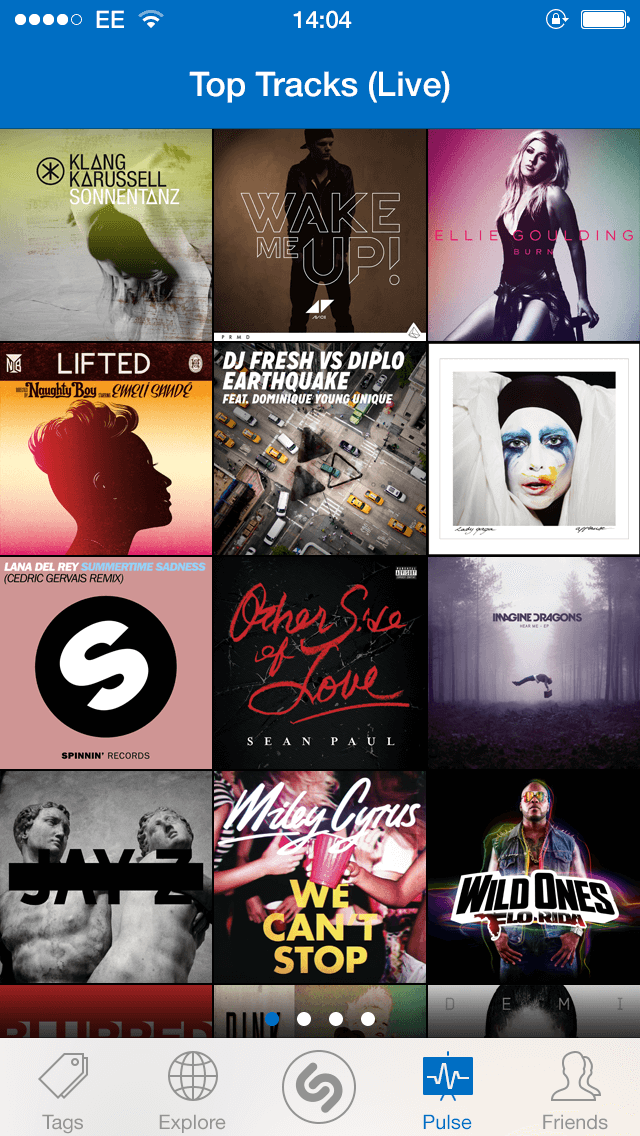
- Top tracks showcase
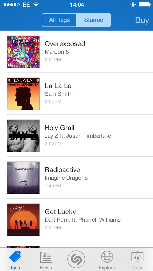
- Star Auto-Tagged tracks
- Native multi-select interaction
- Global trending tracks view
- New in-app news feed
- Social sign-in for friend activity
- Friends’ activity posts
- Branded playlist integration
- Top tracks showcase
- Star Auto-Tagged tracks
- Native multi-select interaction
- Global trending tracks view
Impact
Music to Everyone’s Ears!
The launch was met with overwhelmingly positive App Store feedback, with users praising the modern look and expanded functionality.
Internally, design gained equal footing with development, helping shift company culture and collaboration.
Key outcomes included:
- Recognition as an official iOS 7 launch partner with Apple
- Expansion of Shazam’s role from “tap to identify” to an always-on companion
- Strong trust and working relationships established with engineering teams
- Significant production time saved through efficient batch-processing workflows
“Brilliant! Loving the redesign for iOS 7! Good work you guys.”
Hate cons, iOS App Store ★★★★★
“iOS7 OMG! It's amazing. It look so cool. I love it ;)”
BadFeelsSoGood, iOS App Store ★★★★★
“Wow, Shazam iOS 7 app looks amazing!”
shantanugupta (Bangalore, India), Twitter
Reflection
Working in Perfect Harmony
Working on Shazam was both a privilege and a turning point. It was a chance to modernise a global brand, introduce bold new features like always-listening, and contribute to one of Apple’s most important platform launches.
What began as a request for general improvements became a full reimagining of the app. More importantly, it proved that design could stand shoulder-to-shoulder with development, even in an engineering-led culture.
That shift lasted well beyond the iOS 7 launch.
“Wow. Shazam for iOS 7 is a massive design improvement over the previous versions which have always been lacking and cluttered, IMO.”
shinratdr (Toronto, Ontario), iOS App Store ★★★★★